Context
Overview
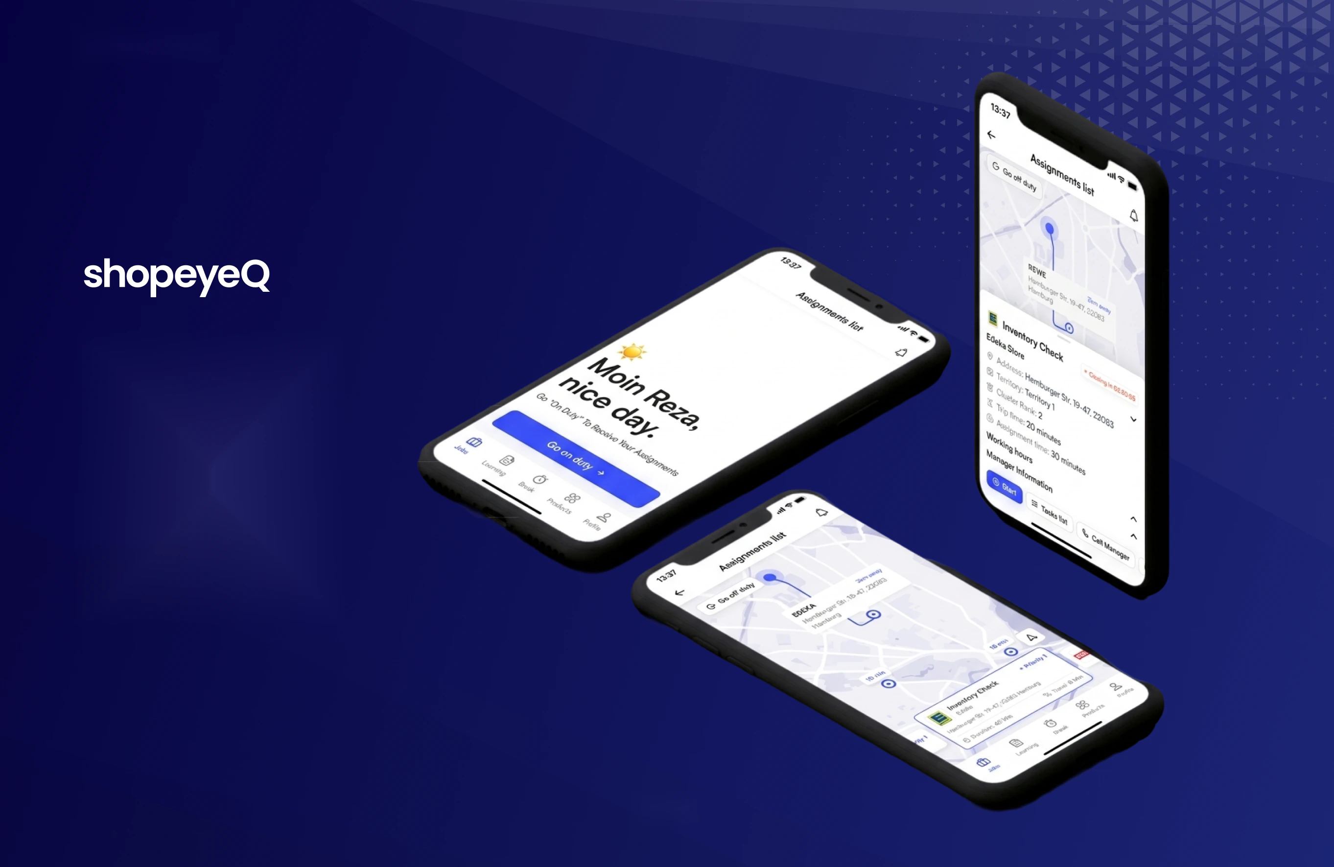
Working on ShopeyeQ was one of the most rewarding projects I've taken on, because the answer came from learning an unfamiliar domain rather than from interface craft. The ask was to design an iOS app for FMCG field sales representatives in Germany - the people who walk into a supermarket and check whether the products a brand is contractually owed shelf space for are actually on the shelf.
My Role
As the lead product designer, I was responsible for research, information architecture, user flows, the design system, and every high-fidelity screen. I worked closely with a product manager, the engineering team, and the ShopeyeQ stakeholders. I created flows, wireframes, and clickable prototypes to share the vision, design principles, and content strategy. This helped to conceptualise ideas, gain alignment, and drive decision making.
Timeline
Over the project timeline we ran regular design reviews with the PM and engineering, plus stakeholder reviews where higher-level business direction was set.
Project Brief
ShopeyeQ is a field sales platform for FMCG brands, built around the store visit: routing a rep between points of sale, checking stock against a contracted portfolio, verifying paid promotions, auditing shelves, and pitching new products.
We needed a way to hold four genuinely different kinds of work inside a single visit, without turning the app into a form the rep has to fight through while standing in an aisle.
The Challenge: Making a difference visible, not a list longer
The app had to be usable one-handed, at speed, in a supermarket - while still capturing evidence accurate enough for a brand to act on. Every screen needed to work with a phone in one hand and a scanner in the other.
Research
We surveyed 50 field sales representatives and ran competitive teardowns of Zoho CRM, Salesforce, Repsly, and Pepperi. One caveat worth stating plainly: respondents came from several industries, not FMCG exclusively. The survey pointed at the shape of the problem, and the FMCG specifics, active hours, portfolio contracts, campaign compliance, came from stakeholder interviews and domain research.
- 63%
- Reporting is the taxNamed reporting the most time-consuming part of the job. Not driving. Not selling.
- 85%
- Live data is non-negotiableCalled real-time access critical. A rep who can't see portfolio data at the shelf works blind.
- 42%
- Tolerance, not satisfactionSatisfaction with the tools they open every single working day.
The teardown finding that mattered
Salesforce and Zoho are CRM systems with a field-sales surface bolted on: the data model is the account, and a visit is an event attached to it. Repsly and Pepperi get closer to the field, but still treat a store visit as a form to complete. None of them treat the visit as the primary object, a bounded window of time, in a physical place, containing several different kinds of work with different completion criteria. That reframe drove the entire information architecture, and it is the single most useful thing the research gave us.
Persona
We built one persona from the survey and the stakeholder sessions. Jason is not a composite of everyone, he is the rep whose day the product is optimised for, which meant every decision later in the project could be checked against him.
“I need to quickly get to my PoS locations, scan products, and ensure the data is accurate so I can focus on making more sales.”
Daily tasks
- Visiting multiple points of sale
- Scanning products against the store's portfolio
- Identifying missing and out-of-stock items
- Reporting back to supervisors
Motivations
- Hitting targets and performance bonuses
- Stronger relationships with PoS staff
- Less admin, more selling
How we'd know it worked
- PoS visited per day
- Accuracy of scanned product data
- Sales performance per PoS
- Manual time vs. value-added time
Frustrations - the ones that drove the design
- Manual data entry: slow and error-prone
- Disconnected tools; CRM sync is painful
- Missed upsell chances without live data
- No efficient route between stores
Information architecture
The PM and I laid out the structure together, and we decided to organise everything around the visit rather than the account, the way every CRM in the category does.
A rep receives assignments, each tied to a point of sale. Each visit contains a task list, every task produces evidence, a scan, a photo, a count, and all of it persists as history waiting on the next visit. Resisting the urge to flatten the work into one generic “task” was the most consequential structural decision I made on the project.
We split the work inside a visit into 4 task types:
| Task type | What the rep is doing | What it produces |
|---|---|---|
| Assortment | Scanning the shelf against the contracted portfolio | Scanned list + portfolio delta |
| Promotion | Verifying a paid campaign runs as specified | Compliance confirmation, or a missing-promo report with photo evidence |
| Shelf audit | Capturing shelf state | Photo capture + structured feedback |
| Upsell | Pitching SKUs the store doesn't carry | Accepted / declined, with reason |
They share a card component and a completion pattern, so the app feels coherent. They do not share a flow, because forcing them into one would have made four of the five worse. This architectural decision had a major impact on the quality of the experience, and let reps move through a visit without relearning the interface for each kind of work.
User flows
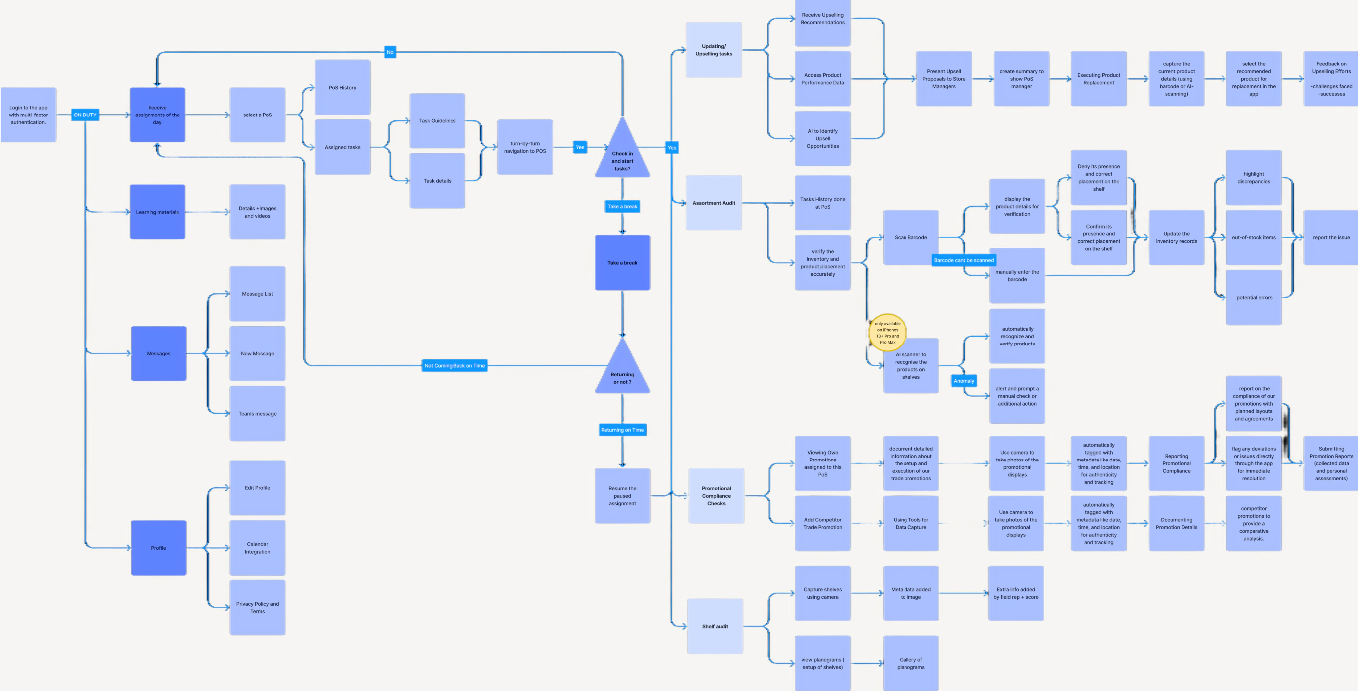
Before any screens, I mapped the whole day as a single flow: a task list arrives from a supervisor, the app routes the rep between stores, and each visit opens a scanning session that has to reconcile against the store's contracted portfolio. Three lanes, and the interesting design work is all in the second one.
1 · Plan
2 · Capture - where the product earns its keep
3 · Close
The two lists, and the number between them
Scanning produces a positive list of what's on the shelf and a negative list of what should be and isn't, derived by comparing the scan against the store's portfolio. The delta number is the count of the second list, and everything downstream, the report, the CRM record, the upsell prompt, keys off it.
The flow that mattered most is the loop back. A rep can leave a session, walk the aisle again, and re-scan into the same record across multiple sessions. Mapping that early is what stopped us designing a single-pass wizard, because a delta produced in one pass is usually wrong, and a tool that forces one pass produces confident bad data.
Wireframes
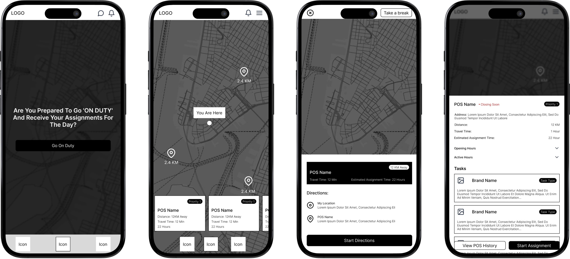
The flows told us what screens had to exist. Wireframing told us whether a rep could actually get through them holding a phone in one hand.
Low fidelity: structure without decoration
Grey boxes, real labels, no colour. The point of this pass was to argue about hierarchy and step count without anyone reacting to a shade of blue. I laid out the task list, PoS navigation, the scanning session, and the CRM handoff at this fidelity and walked them end to end. Iterating here was cheap, which is the whole argument for the stage, restructuring a scanning session takes minutes in grey boxes and half a day once type, colour, and components are attached.
High fidelity: where the decisions got made
Type, colour, iconography, and real component states. This is the pass where the delta stopped being a number in a list and became a red-badged tab, where travel time replaced distance on the map pins, and where the countdown found its home on the PoS sheet rather than the assignment list.
Clickable prototypes came out of this stage and went to stakeholders and reps. Most of the decisions in the next section were settled here, in front of someone tapping through a phone.
Design decisions
Eight decisions shaped the app more than anything else. I have written each one with what it cost, because the trade-offs are the part I learned the most from.
Routing: time, not distance
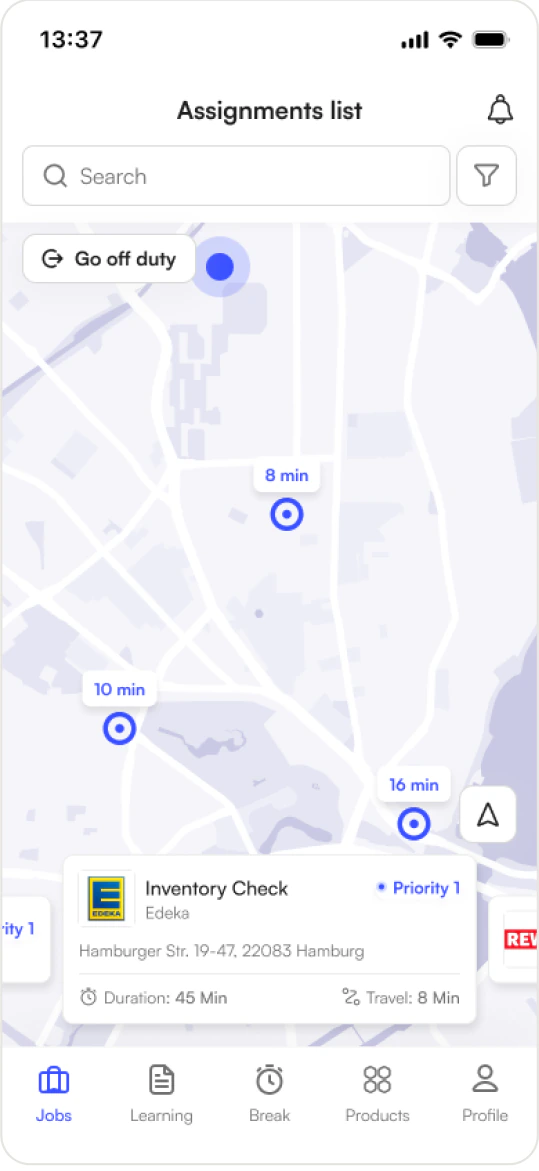
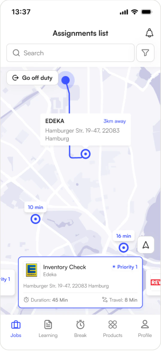
Map pins read 8 min, 10 min, 16 min. Not kilometres. Distance is the wrong unit for a decision about what to do next - a store 3 km away across the Elbe is farther, in the only sense that matters, than one 6 km away on the ring road. Assignment cards carry the same logic, with Duration and Travel sitting side by side so the rep compares the total cost of a visit rather than its position in a list.
Timing: the window inside the window
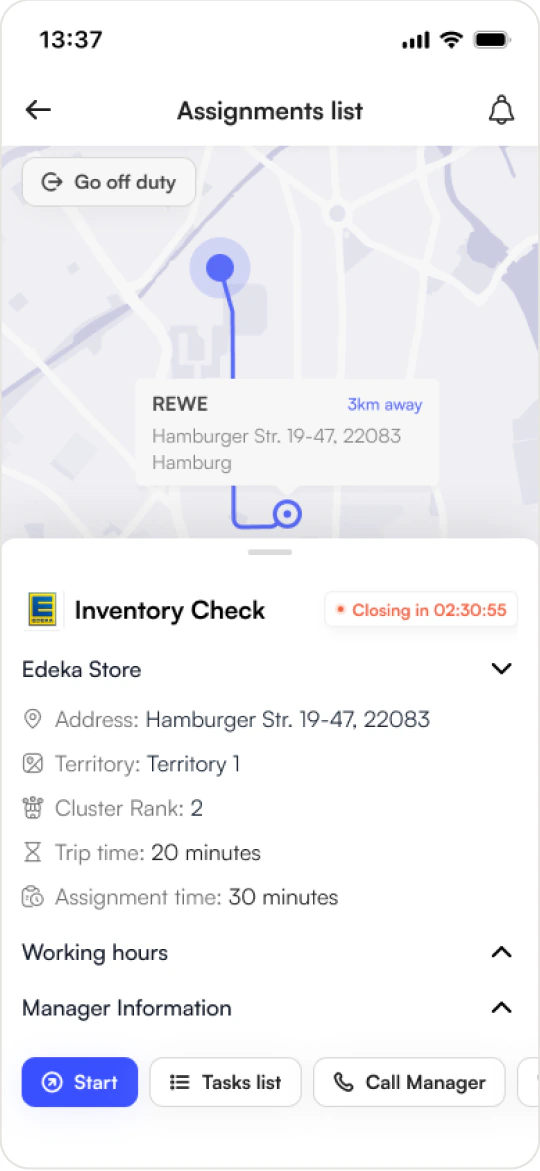
The PoS sheet separates opening hours (09:00–22:00) from active hours (12:00–17:00) - the window when store staff actually permit shelf work. This distinction doesn't exist in general-purpose CRM tools, and it is the single most useful piece of domain knowledge in the product. Paired with it is a countdown in warning red, Closing in 02:30:55, ticking on the PoS card.
Scanning: the diff, not the list
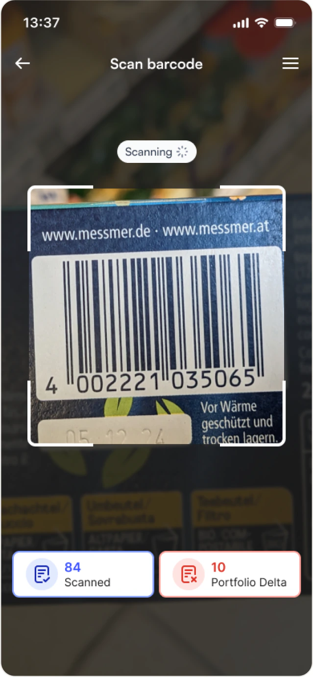
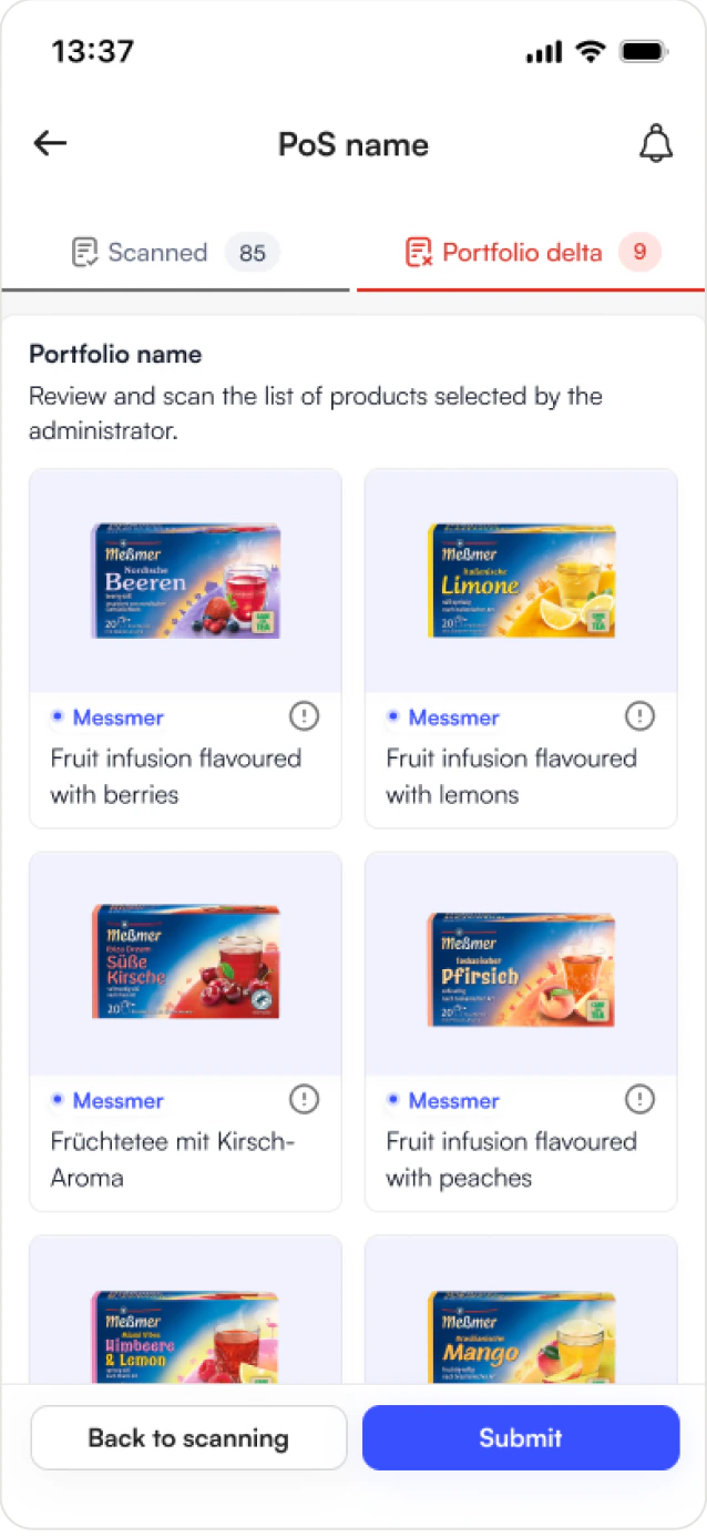
This is the centrepiece. When scanning finishes, results split into two tabs: Scanned - 85 in neutral grey, and Portfolio delta - 9 in error red. Eighty-five products are fine. Nine are contractually supposed to be on that shelf and aren't. The nine are the visit.
Everything in the treatment pushes attention there: red tab underline, red count badge, a number small enough to act on. The delta view groups missing items by portfolio and shows each as a product card with brand tag, image, and full SKU name, because “Messmer Apricot Peach Fruit Tea, 20 bags” is what the rep says to the store manager, not a product code. The two actions are Back to scanning and Submit, so a rep can re-enter the aisle, find what they missed, and return.
Automation: opt-in by design
Route and upsell suggestions live in a distinct mode the rep switches on, not a permanent condition of the interface. Recommendation systems in field tools have a credibility problem: a rep who has worked a territory for seven years knows things the model doesn't, and a route suggestion that ignores the Tuesday loading-bay closure destroys trust in every suggestion after it. A toggle makes the feature earn its place, and gave us a clean way to compare behaviour with it on and off.
Capture: two modes, deliberately
Barcode scan and AI shelf recognition exist as separate flows. Barcode is precise and slow, one SKU at a time, reliable in bad light. AI recognition is fast and probabilistic, good for sweeping a shelf facing. Rather than picking one, the app offers both, because shelf conditions vary more than any single capture method handles.
Rest: a first-class tab
A full Break section with fourteen states sits in the bottom navigation beside Jobs, Learning, Products, and Profile. Putting rest at the same level as the core work was a stance. Field reps are frequently measured on utilisation, and a tool that treats rest as an exception state communicates something about the employer. Making it first-class also gives the rep clean documentation of their own hours.
Compliance: promotions modelled properly
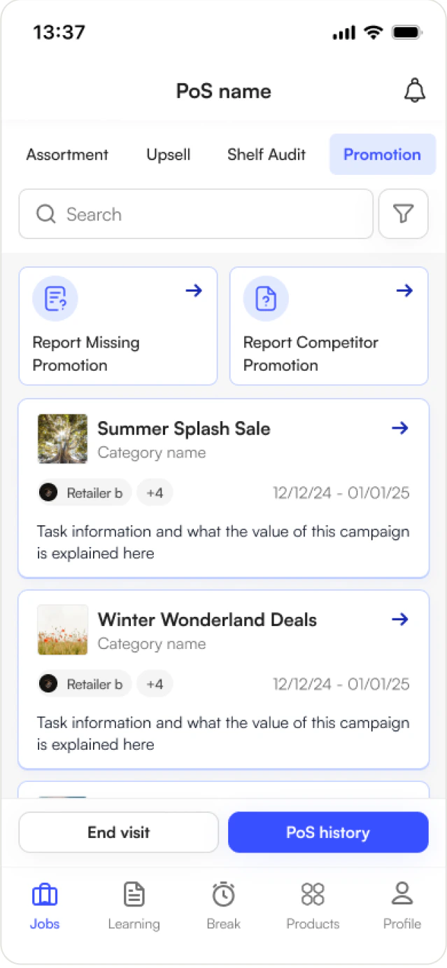
Campaigns are typed, because “is the promotion running?” means something different for each: Multibuy, Temporary Price Reduction, Brand Awareness, Second Placement Only, Bundle. Media placement is modelled separately again - Aisle Fin, Radio, Digital Signage.
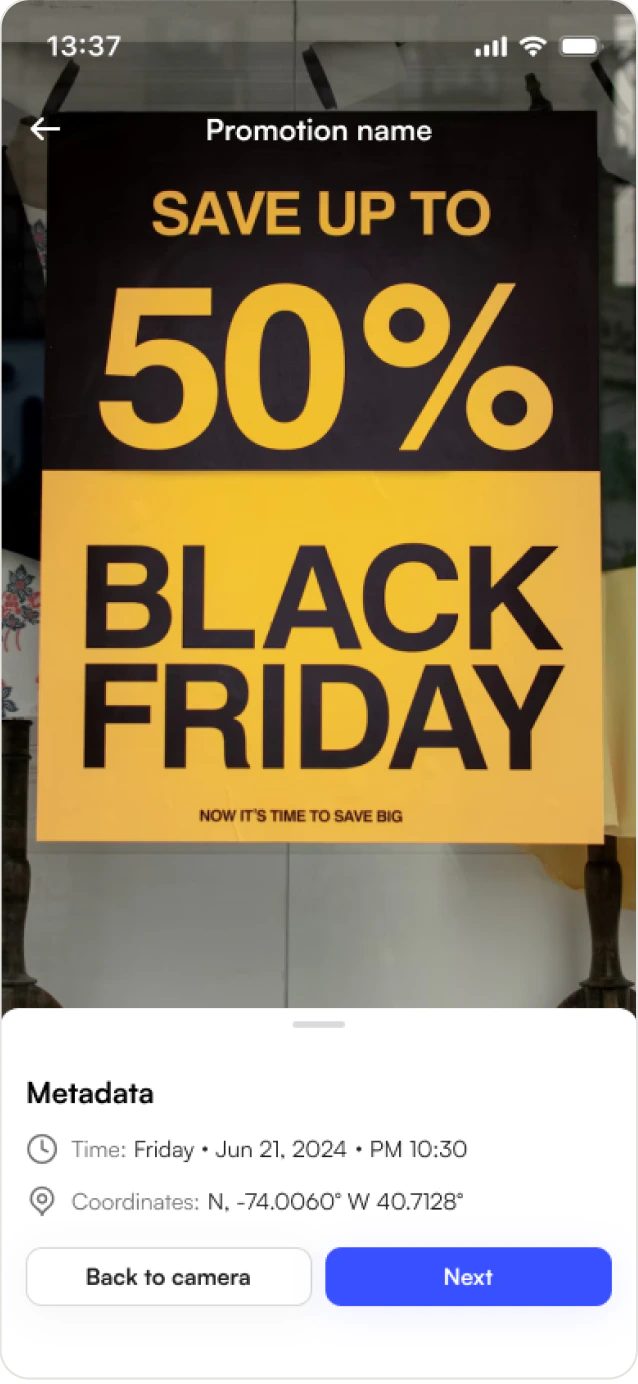
When a promotion isn't running, the rep files a missing-promo report: take photo, photo metadata, submit. Photo plus automatic metadata rather than a text field, because the brand paying for the campaign needs evidence with a timestamp and a location, not a rep's recollection.
Memory: history on every task type
Assortment history with its own portfolio delta, promotion history, upsell history, shelf audit history. A rep walking into a store sees what happened last time before they start. This is what makes the tool a record rather than a form. It is also the first thing that gets cut for scope, which is why I built it across all four types rather than as one generic activity log.
Design system
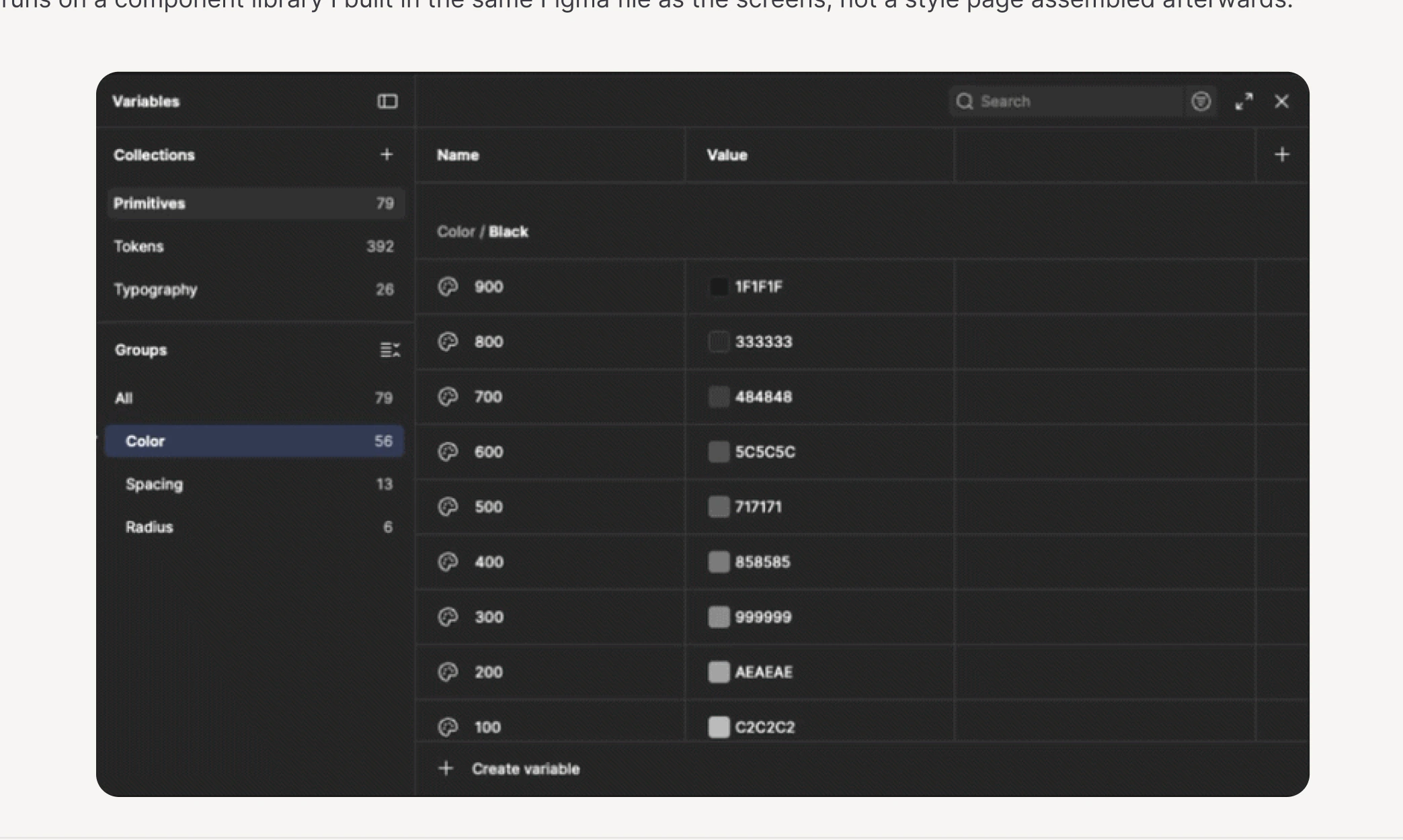
The app runs on a component library I built in the same Figma file as the screens, not a style page assembled afterwards.
- Input field
- 7 types × 4 states
- Button
- 3 sizes × 4 hierarchies × icon variants
- Task card
- 6 states incl. multi-logo, approval
- Product card
- 4 sizes
- Header
- 5 variants
- Logo pin
- 8 map variants
- Tag · Badge · Tabs · Toggle · Slider
- Notification, Message, Learning card
The decision that paid off most
Seven composite PoS modules, PoS Info, Contacts, Working Hours, Top Selling, From Corporate, Competitors, All Products, each built with a Default and a Minimized state. That pairing meant the PoS bottom sheet composes from modules that collapse independently, so it could be reconfigured per store type without designing new screens.
Result
After many rounds of reviews and iterations, we arrived at an app designed around a single organising idea: a shelf is not a list, it's a difference. Routing shows travel time, the store sheet counts down to the window when a rep can actually work the aisle, and every task type keeps its own history, so someone walking into a store sees what happened last time before they start.
The companion piece is the seQ Portal, the manager platform that dispatches the assignments this app receives, defines the portfolios it scans against, and consumes the deltas it reports. The two were designed together, and neither makes complete sense alone.
Takeaways
The domain model was the design
The best decisions here, active hours, the delta split, typed campaigns, per-task history, came from understanding how FMCG field sales actually works, not from interface craft. The visual layer is competent and mostly invisible. Learning the domain deeply enough to argue about it with stakeholders was the most valuable thing I did on this project, and it is the habit I have carried into everything since.
Splitting things is usually right
Four task types instead of one generic task. Scanned versus delta instead of one list. Two capture modes instead of a compromise. Each split cost a little coherence and bought a lot of fit, and I would make the same calls again.
Automation needs an off switch
Putting route and upsell suggestions behind a toggle was a bet that trust compounds and forced adoption does not. Working through that decision taught me to ask what a feature costs in credibility, not just what it adds in capability.
What I would change
Offline is claimed but not designed. The competitive analysis names offline functionality as a gap in rival tools, but there are no offline states here - no queued-sync indicator, no stale-data treatment, no conflict resolution when two sessions diverge. Reps work in the backs of supermarkets where signal drops, and this is the biggest unfinished edge of the product.
Empty and error states are also thin relative to the happy paths, and whether four task types is the right amount of surface for a phone used one-handed at speed is a question only field observation answers. The IA holds up in a prototype; I would want to watch it hold on a rep's ninth store of the day.