Context
Overview
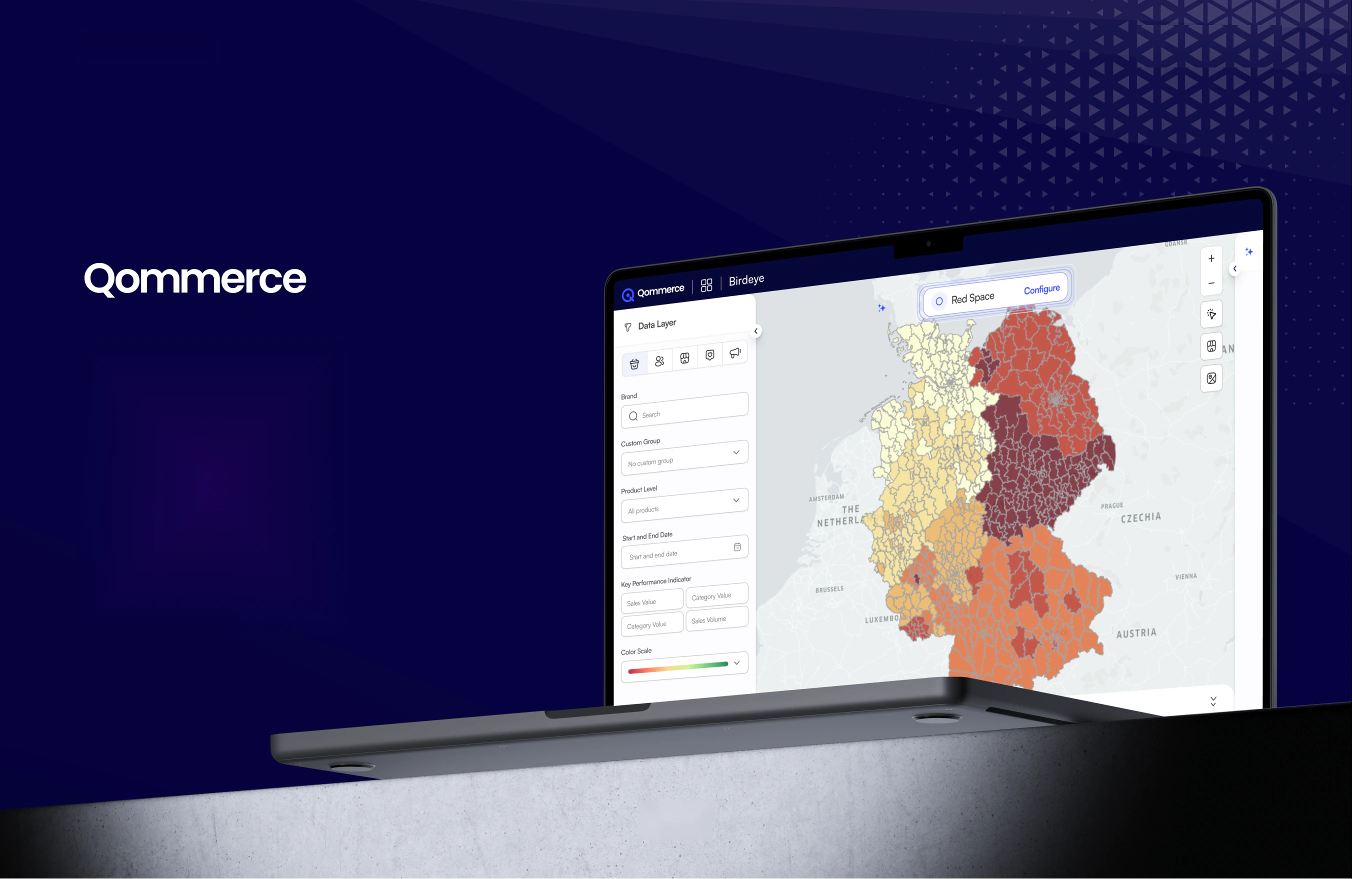
seQ Portal is the manager side of ShopeyeQ: territory planning, assignment dispatch, shelf intelligence, and an automation engine that turns a detected problem into dispatched fieldwork without a human in the loop. Designing it was the most demanding project I have worked on, because a dense B2B platform punishes every ambiguity a consumer app forgives.
My Role
As the product designer, I ran the interviews and competitive analysis, shaped the information architecture, designed all eight modules and the workflow builder, ran usability testing, and built the design system. I worked with a product owner, the development team, and QA. Prototypes carried the thinking through stakeholder workshops, which is where most of the scoping decisions were settled.
Project Brief
A regional manager oversees dozens of stores through a stack of tools that don't speak to each other: sales data in one system, field team schedules in another, campaign compliance in a spreadsheet a rep emailed on Friday. By the time a picture assembles, the week it describes is over.
The deeper issue wasn't visibility. Most of these managers could eventually find the number they wanted. What they couldn't do was act on it without opening three more tools and typing the same instruction five times.
The Challenge: Managers could see everything and change nothing
One surface had to serve a regional director and a store supervisor without becoming either useless or overwhelming, and it had to close the gap between noticing a problem and doing something about it.
Four requirements came out of the brief:
Data overload
Real-time, digestible insight instead of reports nobody opens. The raw numbers already existed; the reading of them did not.
Task and visit planning
Assigning and tracking field teams needs one clear workflow, not a scheduling tool bolted to a messaging app.
Performance tracking gaps
Sales trends, team efficiency, and campaign results should be legible at a glance and drillable on demand.
Scalability across roles
One surface has to serve a regional director and a store supervisor without becoming either useless or overwhelming.
Research
I interviewed retail managers, field supervisors, and sales executives about how they actually run a week. Three lines came up in nearly every conversation, and each one turned into a module.
“I waste too much time pulling reports from different sources.”
Became Business Intelligence - named metrics and saveable Collections
“Assigning tasks manually is frustrating.”
Became Assignments and, eventually, the Automate workflow engine
“We lack visibility into field team performance.”
Became People, Teams, and territory-level KPI tracking
What the incumbents taught us
| Platform | Strength | Weakness |
|---|---|---|
| Zoho CRM | Strong automation, solid reporting | Cluttered surface, steep learning curve |
| Salesforce | Powerful analytics, customisable dashboards | Complex UI, requires extensive setup before it's useful |
| Repsly | Excellent field team tracking, mobile-first | Thin customisation for managers |
| Pepperi | Strong B2B sales automation, omnichannel insight | Dated UI, limited workflow flexibility |
The pattern: the CRMs had automation but buried it behind configuration, and the field tools had good tracking but no way to act on what they tracked. Nobody had put a plain-language automation builder in front of a field ops manager. That gap became the product's centre of gravity.
Information architecture
The first IA came out of stakeholder workshops and listed nine modules. The shipped sidebar has eight, and two of them did not exist in the original plan. The differences are the most honest record of what we learned.
Planned · 9 modules
From the stakeholder workshops
- Assignments & Task Manager
- People & Team
- Business Intelligence
- All Products & Portfolio
- Onboarding
- Competitor Brands
- Promotions
- Point of Sale
- Account Management
Shipped · 8 modules
What the sidebar actually holds
Product
Absorbed Portfolio and Competitor Brands as sub-views
Promotions
Split into manual and recommended campaigns
PoS
Gained planograms, groups, and an approval queue
People
Merged with Teams and territories
Assignments
Bulk and single dispatch, plus a board view
Business Intelligence
Named metrics plus saveable Collections
Automate
New - the workflow engine, not in the plan
Integration
New - third-party and data-source connections
Two changes are worth naming. Onboarding stopped being a destination and became a progressive checklist on Home, nobody navigates to onboarding, they encounter it. And Account Management dissolved into Settings, where roles, GLN verification, and account verification live as separate flows rather than one page of toggles.
The shipped module map
Eight modules, each with its own list view, detail view, and creation flow. This is the structure the whole platform hangs off, and the level at which most of the hard scoping decisions were made.
Product
All products (grid + list), Product details, Variations, Logos, Portfolio, Competitor Brands, Planograms
Promotions
Trade - manual and recommended, Campaign details, Locations, Products, Assets, Completed trade, Reports
PoS
All PoS, Details, Portfolio, Contacts, Custom groups, History with approval states
People
Users, User details, Calendar, Teams, Team territories, Team members
Assignments
Single and bulk creation, Assignment list, Assignment board, Task management, Visits
Business Intelligence
Dashboard, Products, Teams, Competitors, Collections, Location filter, the named metric set
Automate
Not in the original planWorkflow builder - Triggers, Actions, Control Flow, Conditions, Edit workflow
Integration
Not in the original planData sources, Third-party apps, Social media, Shopeye app connection
Two structural rules kept it navigable. Every module resolves to the same three shapes, a list, a detail, and a wizard, so a manager who learns one learns all eight. And anything cross-cutting (the location filter, the approval queue, the metric set) is built once and reused rather than reimplemented per module.
The argument for building Automate
Every dashboard ends with a manager deciding to do something. The interesting question is what sits in that gap.
Design decisions
Eight decisions shaped the platform more than anything else. I have written each one with what it cost, because on a product this dense the trade-offs are the part I learned the most from.
The largest decision in the product. Rather than shipping a fixed set of alerts, we built a canvas where a manager composes their own logic from four palettes: Triggers, Actions, Control Flow, and Conditions.
Triggers are written in the domain, not in database terms - product event, shelf event, store event, micro-area event, team event, agent event. A manager who knows their job can read that list and know what each one means without documentation.
Control Flow is where it stops being an alert tool: Threshold with summation, average, or custom aggregation; Loop Until bounded by a start and end date; Switch Case for branching; and Error Handling as a first-class block. A manager can express “run this weekly until the campaign ends, branch on region, and tell me if a store stops reporting” without writing a line of code.
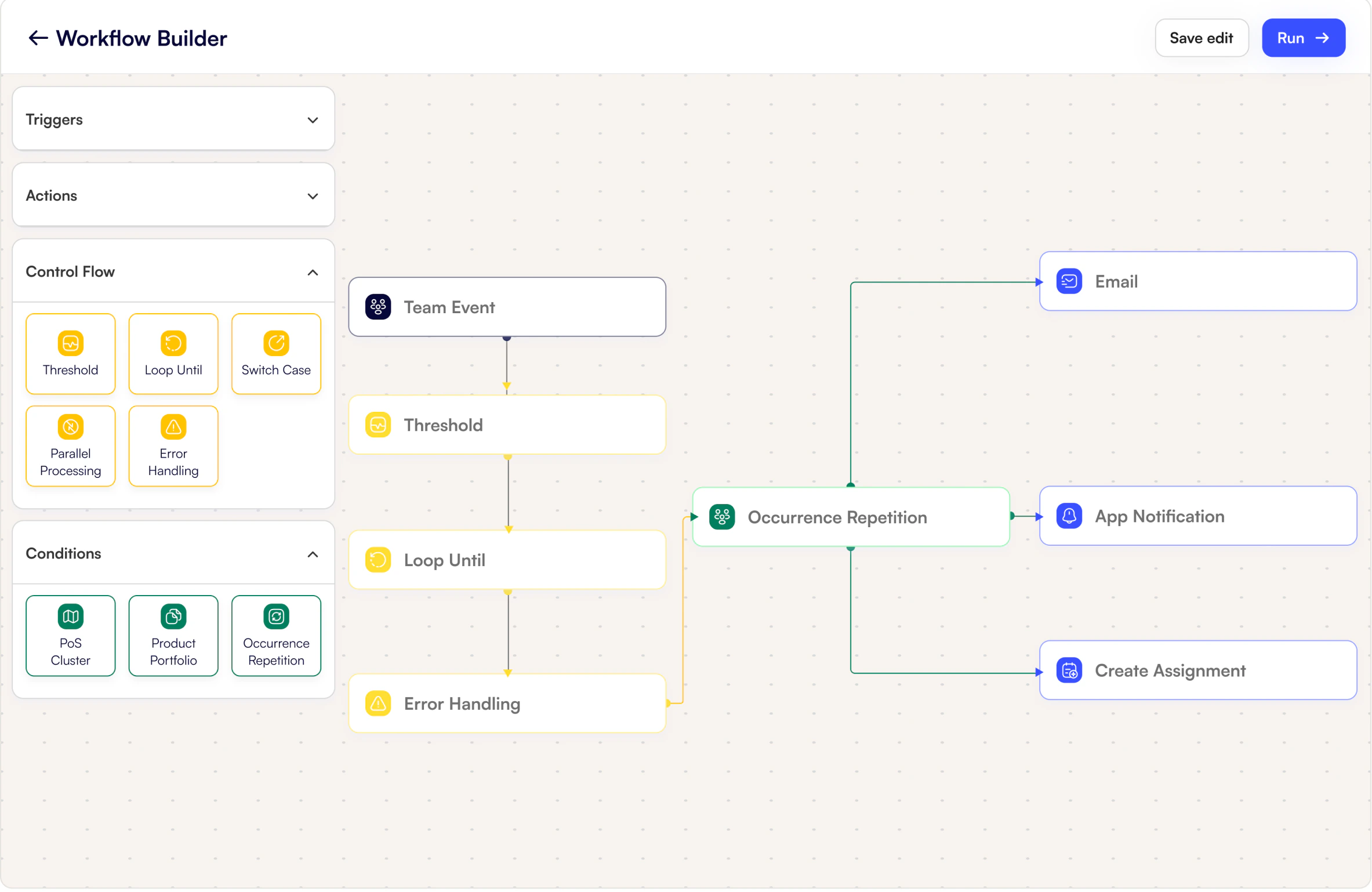
Automations fail silently, and a silent failure in field ops means a store goes unvisited while a dashboard says everything is fine. So Error Handling sits in the Control Flow palette next to the others, and it distinguishes two states that look identical to a naive system: inactive with no data, and inactive with data.
The first means nothing happened. The second means something happened and the workflow didn't catch it. Collapsing them into one “inactive” state would have hidden the only failure mode a manager actually needs to know about.
The original IA had Onboarding as a nav destination. Nobody navigates to onboarding. It became three dismissible progress cards on Home, account verification, GLN setup, product onboarding, each with a percentage and a single Complete action.
GLN setup deserves the space it gets. A Global Location Number is what ties an account to real retail locations in GS1 data, and without it most of the platform's geography is guesswork. Making it a blocking-but-dismissible card on the first screen was the compromise between nagging and letting people build on sand.
Creating one visit and creating four hundred are different tasks wearing the same name. Both run a three-step wizard, schedule, location, tasks, but they diverge at every step. Single assignment picks a user and a PoS. Bulk assignment picks a territory or a filtered PoS set and fans out across it. Scheduling splits the same way: a single repeat versus multiple times across a date range.
Keeping the step count and vocabulary identical across both meant a manager who learned one already knows the other, while the actual mechanics stay honest about the difference in scale.
Retail territories do not follow postal boundaries, so the portal lets managers draw them. Draw-on-map, precision areas, and value-based clusters let a territory be defined by where the value actually is rather than by an administrative unit somebody else chose.
Value-based clustering was the piece that justified the effort: it groups points of sale by contribution rather than proximity, so a rep's day is organised around what a visit is worth, not just what's nearby. Territories then bind to teams, and assignments fan out across them.
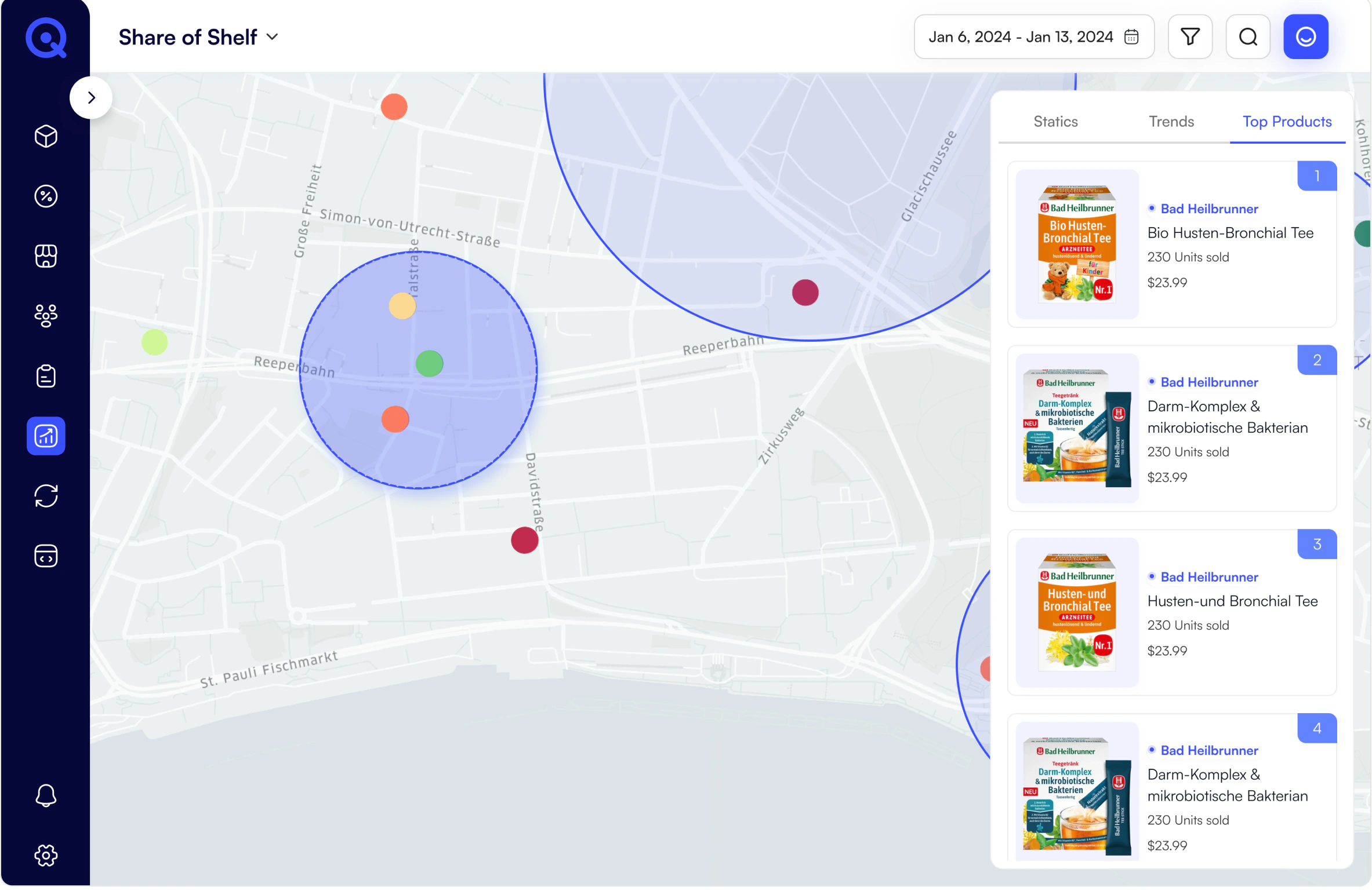
Field-captured data feeds commercial decisions, so PoS history runs through explicit states - Pending, Approved, Rejected - rather than landing in the database as fact. A manager reviews assortment, upsell, shelf audit, and promotion submissions before they count.
Testing surfaced that task status was not legible, so status became colour-coded across every surface with a consistent mapping. The same rule governs verification: account and GLN verification are multi-step flows with visible progress, not a checkbox.
Testing
5 managers
·
60 min remote
·
Figma prototype
We ran a one-hour remote session with five managers from Messmer, an established German tea brand, using a Figma prototype. Each was given a scenario rather than a task list: you are a regional manager overseeing multiple stores; assign a visit task to a rep, check sales performance, and review a competitor’s latest campaign.
Participants thought aloud while working, and we closed with a structured interview. Five tasks: navigate the overview, assign a field task, filter business intelligence, review a competitor brand report, adjust a promotion.
What held up
Task assignment felt intuitive
Managers assigned work using filters and quick actions without prompting.
Dashboard widgets read fast
KPIs and reports were structured well enough for at-a-glance scanning.
Competitor tracking was valued
A dedicated section for monitoring rival promotions was called out unprompted as something they'd use weekly.
What broke → What changed
Task status wasn't legible
Introduced colour-coded status indicators, applied consistently across every surface that shows a task.
Business Intelligence was overloaded
Rebuilt on progressive disclosure - headline figures first, drill-down on demand. The metric set did not shrink; the first screen did.
Navigation felt overwhelming at first
Regrouped the sidebar so related actions sit together. This is the change that eventually produced the eight-item structure.
Five participants is enough to find blocking usability problems and not enough to settle a preference question. All three changes above were blockers, people failed tasks or hesitated visibly, which is what a session this size is good for.
UI guidelines
Before the component library came the guidelines: what the brand should feel like on a data-heavy screen, how type should carry hierarchy, and what each colour is allowed to mean. A dense B2B platform punishes ambiguity here more than a consumer app does.
Branding and colour
The identity had to read as trustworthy and data-driven without going cold. Deep navy anchors the persistent chrome so the working canvas stays white and legible; royal blue is the single interactive colour. Soft neutrals and greys carry everything else, and accents are strictly functional.
Deep navy
Persistent chrome only - sidebar and headers. Never a content background.
Royal blue
The only interactive colour. If it is blue, you can click it.
Signal yellow
Reserved for control-flow nodes in the workflow builder.
Green
Approved, complete, healthy. Status only.
Amber
Pending, at risk. Status only.
Red
Rejected, error, out-of-stock. Status only, never decoration.
Typography and iconography
A bold modern sans across three weights, each doing one job. Large headlines for scanning a page, mid-weight body for reading a row, light labels so the interface chrome recedes behind the data. Icons are rounded and minimal, recognisable at 16px in a sidebar, and never competing with a chart.
Headline · Bold · Scanning
Out-of-Stock Incidents
Body · Regular · Reading
Shelf share dropped 4% across the North region this week.
Label · Light · Chrome
ASSIGNED TO • TERRITORY • DUE
Spacing & layout
- A structured grid shared across every module
- Modular card-based composition, so density varies without the layout breaking
- Fixed sidebar, scrolling canvas - navigation never moves
- Consistent gutters between widgets regardless of widget size
Interaction patterns
- Defined behaviours for gestures, transitions, and feedback
- Subtle motion only - nothing that delays a manager mid-task
- Every destructive action confirms; every long action reports progress
- Filters persist across views rather than resetting on navigation
Design system
A dense B2B platform punishes inconsistency faster than a consumer app does, because a manager reads a hundred small labels a day and any drift between them costs a second each time. The system had to standardise components and, more importantly, meaning.
Deep navy
#191970
Royal blue
#3950FF
Control flow
#F9C832
Approved
#1BA35D
Pending
#D99818
Rejected
#D92D20
Border
#EDEDED
Surface
#F7F7F7
Deep navy anchors the persistent sidebar so the working canvas stays white and legible. Royal blue is the only interactive colour - if it is blue, you can click it. Yellow is reserved for control-flow nodes in the workflow builder and appears nowhere else, so a manager scanning a canvas can separate logic from data at a glance. Green, amber, and red carry status and never decoration.
Components and behaviour
- Sidebar navigation
- Collapsible, eight modules plus notifications and settings
- Cards and widgets
- At-a-glance insight, composable into the Home workspace
- Tables and item cells
- Row selection, bulk action, grid and list views of the same data
- Interactive charts
- Line, bar, and combined; colour-coded to the fixed metric vocabulary
- Dropdowns and filters
- Location filter reused across BI, map, and assignment flows
- Workflow nodes
- Trigger, action, control flow, condition - four visual classes
- Multi-step wizards
- Assignment, planogram, promotion, and verification all share the pattern
Result
What shipped is eight modules sharing three shapes, a list, a detail, and a wizard, with a workflow builder at the centre that nobody had asked for by name. Feature adoption, task completion rates, and time-to-insight were tracked after launch, which are the right three metrics.
I tracked adoption and completion post-launch; unfortunately I no longer have access to the figures.
The companion piece is the ShopeyeQ field sales app, he rep side that receives the assignments this platform dispatches and reports the shelf data it reasons over. The two were designed together, and neither makes complete sense alone.
Takeaways
A dashboard is only half a product
The research said managers couldn't find their numbers. The real complaint underneath was that finding a number didn't change anything. Building Automate was the decision that took the brief seriously instead of literally, and it is the thing that makes this a platform rather than a reporting tool.
Naming a metric is a design act
Fixing the definition of “shelf share” in the product does more for a team than any chart. The visual layer of BI is ordinary; the vocabulary underneath it is the work.
The shipped IA is the honest one
We planned nine modules and shipped eight, two of which nobody had thought of. Showing that gap is more useful than presenting the final structure as if it arrived fully formed.
Density needs a colour discipline
On a surface this crowded, letting a colour mean two things is how a system starts to rot. One interactive colour, one logic colour, three status colours, and nothing decorative.
What I would change
The workflow builder has no simulation mode. A manager can compose logic that dispatches real work to real people, and the only way to find out whether it does what they meant is to run it. A dry-run that shows what would have fired over last month's data is the missing safety net, and its absence is the biggest risk in the product.
Eight modules is a lot of surface to keep coherent. Every one has its own list view, detail view, creation wizard, and empty state. The system holds, but the volume means an inconsistency introduced in one corner can survive a long time before anyone notices.
Mobile was scoped as tablet-friendly, not designed. The research called for on-the-go access. What shipped is a responsive-enough desktop layout, which is not the same commitment.