Context
Overview
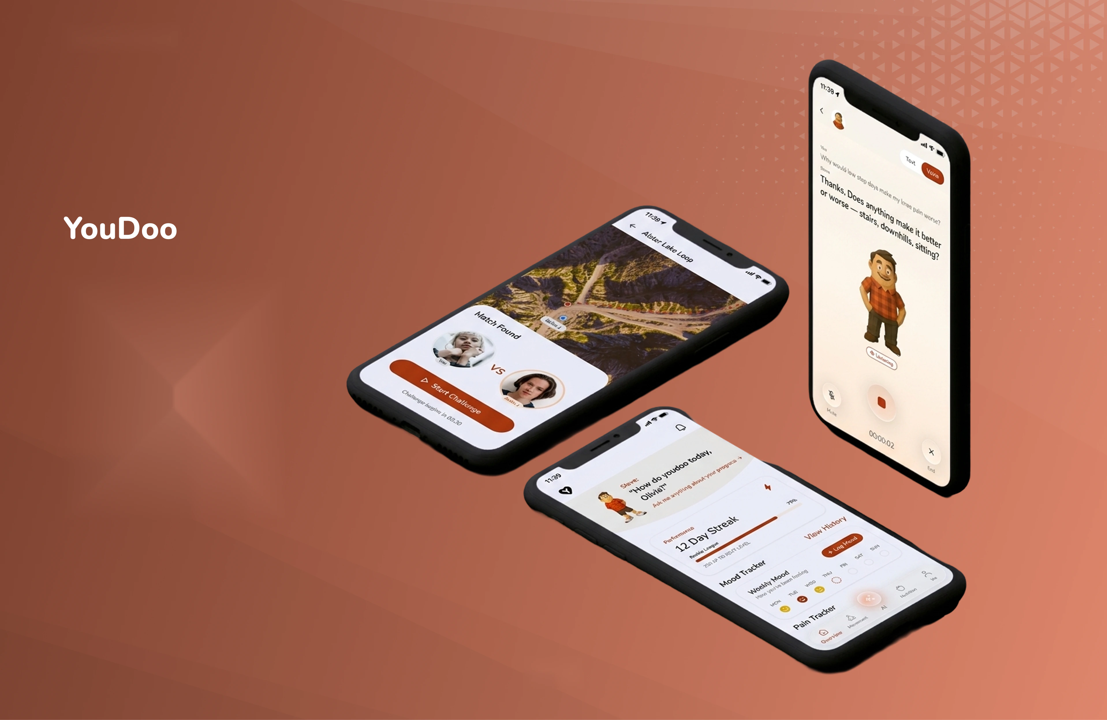
YouDoo is a smart health assistant built around a simple observation: people already have the data, spread across half a dozen apps, and none of it tells them what to do next. The project set out to join mood, movement, and nutrition into one place and turn that combined picture into something actionable, recipes that respect a dietary restriction, challenges that motivate without intimidating, and insights that connect how someone slept to how they feel.
My Role
I ran the competitive analysis and social listening, mapped the user journey, built the personas, and designed everything from low-fidelity wireframes through to the high-fidelity screens. I also built and tokenised the design system, and prepared the developer handoff.
Project Brief
In today’s digital health ecosystem, users rely on multiple disconnected apps to track fitness, nutrition, and mental well-being, leading to fragmented data, low engagement, and difficulty in building consistent habits. While tools like Apple Health aggregate data, they lack personalised, actionable guidance and meaningful social interaction.
Users also struggle to align their dietary needs, allergies, and lifestyle goals with daily decisions such as what to eat or how to stay active. There is a need for a unified, intelligent solution that not only tracks health metrics but translates them into personalised insights, social motivation, and simple, actionable steps.
The Challenge: Health management is fragmented across multiple apps
Fragmentation leads to low engagement and a lack of actionable insight. The job was not to build another tracker, but to make the combined picture worth opening every day.
Research
Competitive analysis: identifying gaps in health and wellness apps
I analysed leading health and wellness apps to uncover gaps in fitness tracking, nutrition management, and mood monitoring. Platforms like MyFitnessPal excel at food tracking and Strava at social activity engagement, but none offer a fully integrated solution that combines mood, movement, nutrition, dietary restrictions, and social challenges.
These insights guided the design of YouDoo, creating a unified health companion that delivers personalised insights, actionable recommendations, and social motivation, all in a single, seamless experience.
Social listening: understanding users through conversations
To design a health companion people would actually keep, we listened across forums, reviews, and social media to see how users talk about fitness, nutrition, and mental well-being. They were frustrated by fragmented apps, inconsistent guidance, and a lack of social support.
Common pain points
- Difficulty keeping track of multiple apps and data points
- Limited personalisation in workout and meal recommendations
- Feeling unmotivated or isolated without social accountability
What that meant for the design
- Integrated tracking of mood, movement, and nutrition in one platform
- Personalised recommendations based on goals, restrictions, and habits
- Social motivation through challenges, leaderboards, and friend support
Listening to real conversations meant YouDoo could address both the practical need and the emotional one, an experience that feels supportive rather than another thing to keep up with.
User journey
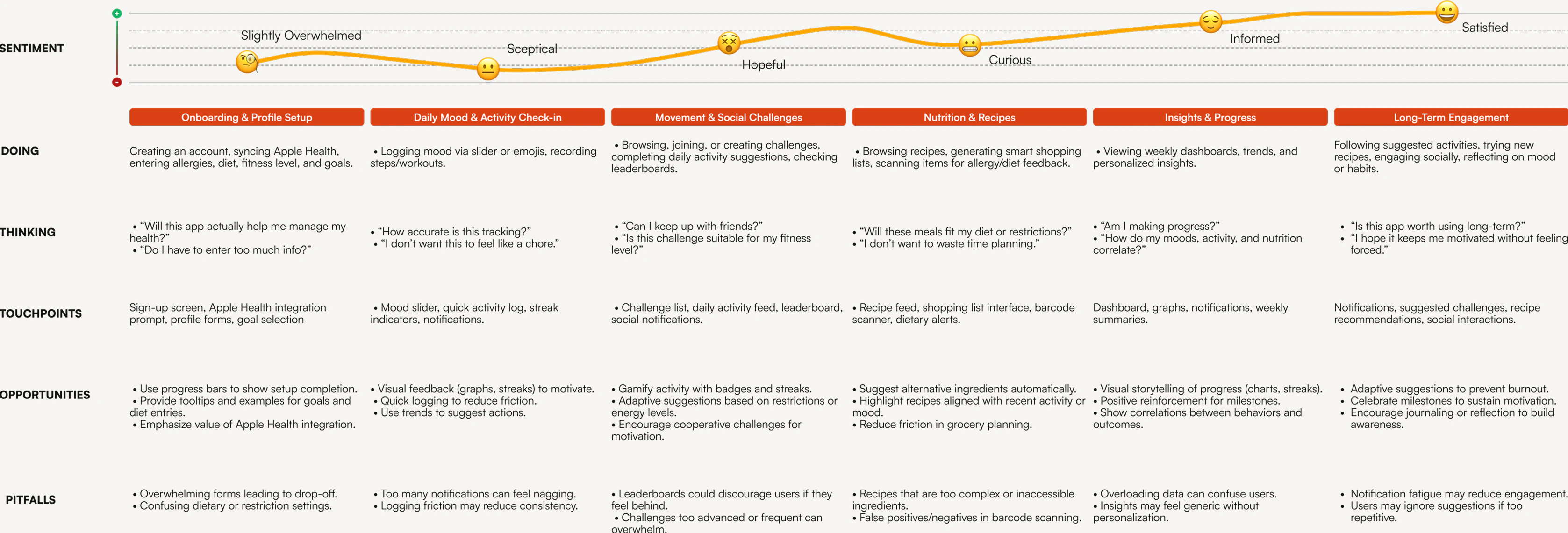
To understand how someone moves between the different parts of their well-being, we mapped the complete YouDoo journey, from onboarding and mood logging to joining challenges, discovering recipes, and tracking progress. Visualising it surfaced the touchpoints, the friction, and the places personalisation would actually pay off.
Each step had to feel intuitive, motivating, and connected, so mood, movement, and nutrition read as one loop rather than three separate chores.
Persona
We built personas from the research, the social listening, and observed behaviour patterns, capturing motivations, goals, challenges, and lifestyle habits so features could be checked against a real person rather than an average.
Early-career professional, moderately active, health-conscious, enjoys cooking, socialising, and weekend hikes.
Goals
- Maintain a balanced diet while managing mild gluten intolerance
- Track daily activity and build consistent fitness habits
- Understand how mood, sleep, and nutrition impact energy and productivity
- Join fun, social challenges with friends to stay motivated
Motivations
- Wants an all-in-one, easy-to-use health companion
- Seeks personalised insights for smarter daily choices
- Enjoys supportive social engagement, not pressure
- Appreciates visual progress tracking for motivation
Expectations
- Quick and effortless tracking - logging mood, activity, and meals should be fast and intuitive
- Personalised guidance that matches her goals, energy, and restrictions
- An integrated experience that consolidates fitness, nutrition, and mood in one place
- Social motivation through supportive challenges, without feeling pressured
Frustrations & pain points
- Uses multiple apps for fitness, nutrition, and mood tracking; finds it overwhelming
- Often forgets to log meals or workouts during busy workdays
- Struggles to find recipes that match dietary restrictions and taste preferences
- Social fitness apps feel competitive or intimidating
Wireframes
To turn research insights into something tangible, I built low-fidelity wireframes mapping YouDoo’s core features, navigation, and flows. Working at this fidelity kept the conversation on information hierarchy, content placement, and task flow rather than visual styling.
Five key flows
- Onboarding & profile setupQuick setup of mood, activity, diet, and restrictions
- Daily mood & activity loggingEasy, one-tap check-ins and activity updates
- Movement challenges & leaderboardsBrowsing, joining, and tracking challenges with friends
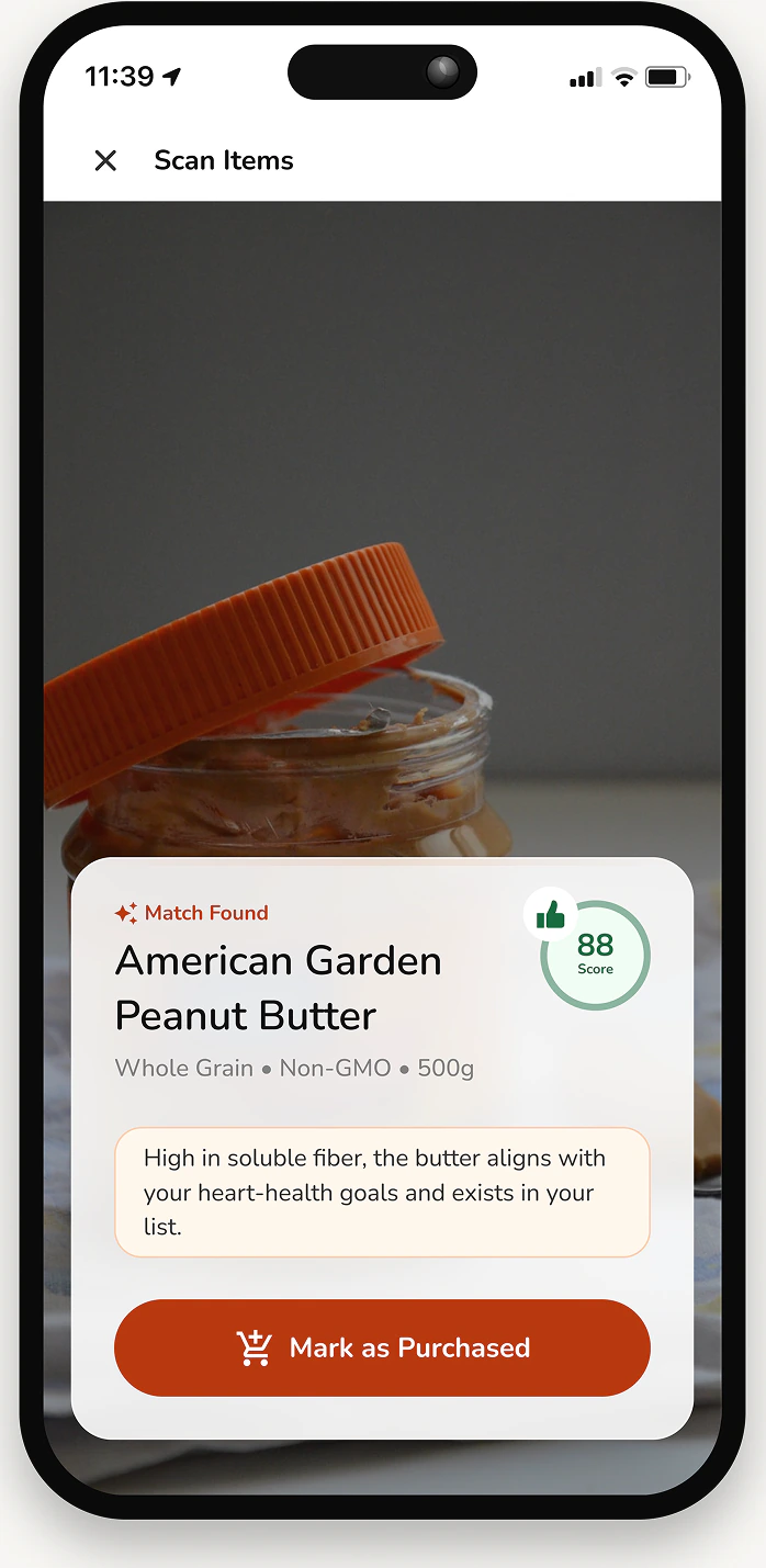
- Nutrition & recipe discoveryBrowsing recipes, generating shopping lists, and scanning items for dietary compatibility
- Insights & progress dashboardVisual summaries of mood, movement, and nutrition trends
Testing these wireframes early identified pain points in navigation and task completion, which informed the refinements carried into the high-fidelity designs.
Design system
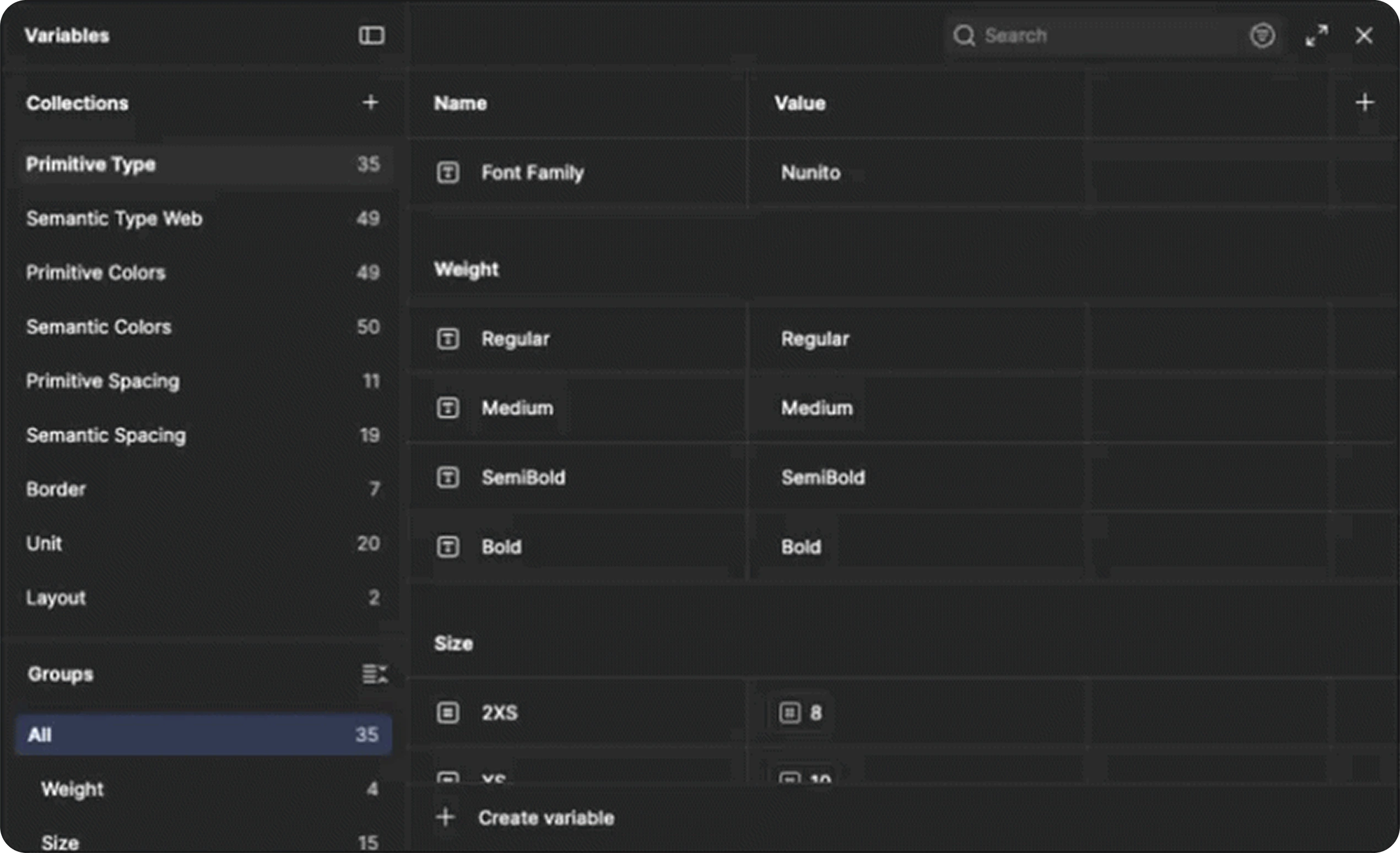
To keep the product consistent as it grew, I built a design system that establishes a unified visual language and set of interaction patterns supporting clarity, accessibility, and ease of use across every feature.
- Colour palette
- Soft, calming tones with vibrant accents to reflect mood and energy
- Typography
- Clean, readable type for clear hierarchy and quick scanning
- Components
- Reusable buttons, cards, sliders, and navigation
- Iconography
- Simple, expressive icons to aid usability and emotional connection
- Spacing & layout
- A structured grid system for consistency across screens
- Interaction patterns
- Defined behaviours for gestures, transitions, and feedback
Tokens before screens
Every design element was tokenised and converted into variables, primitive tokens for base colours, spacing, and typography values, and semantic tokens for primary actions, success states, and mood indicators. That split is what made flexible theming possible, kept updates cheap, and gave design and development the same vocabulary to work from.
The result is a system that stays coherent as the product grows, and lets a new screen be assembled rather than drawn from scratch.
High-fidelity designs
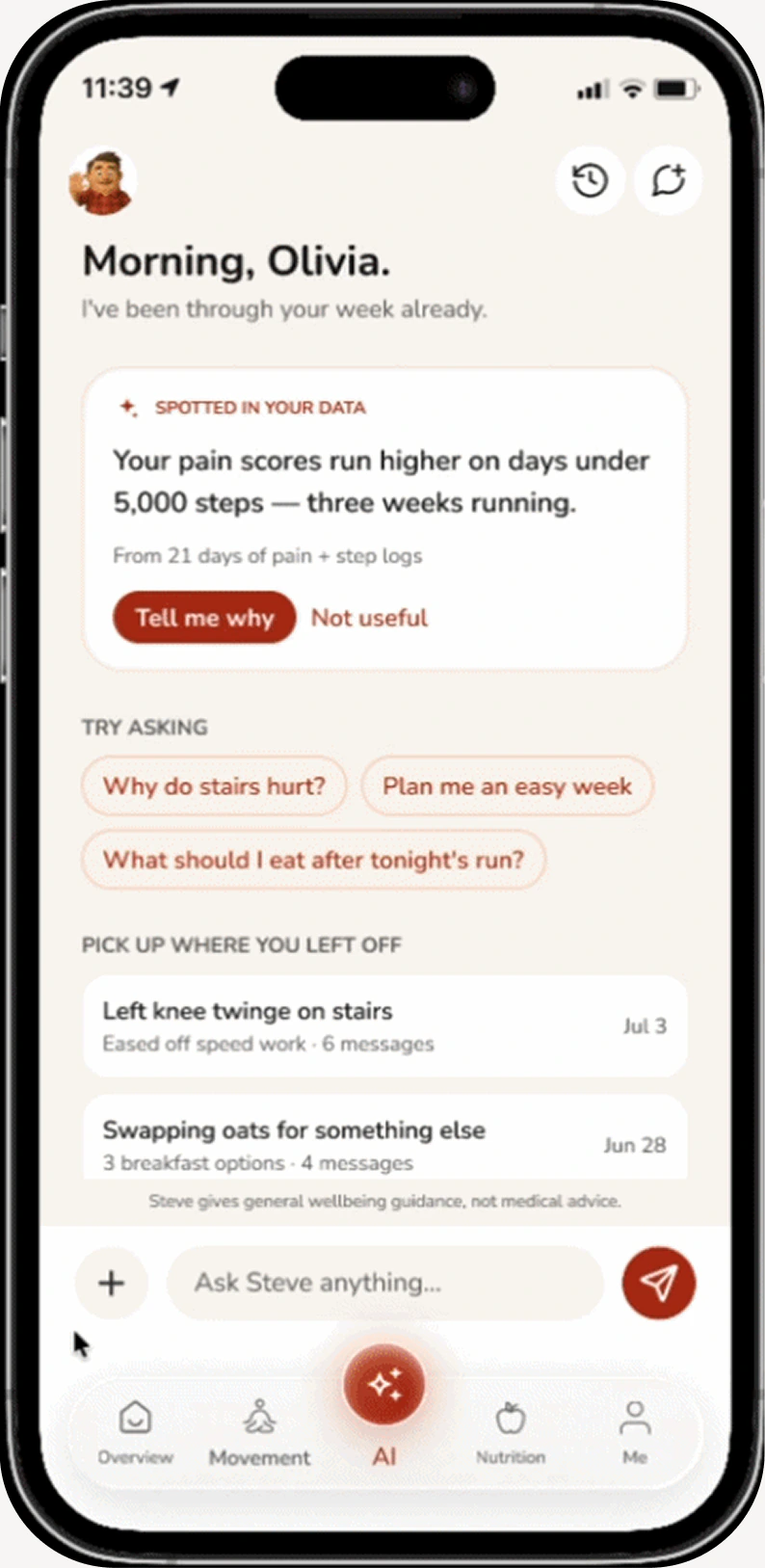
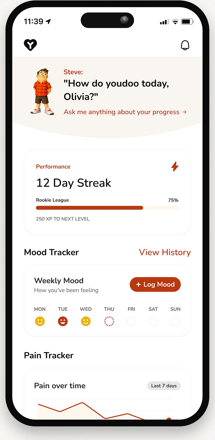
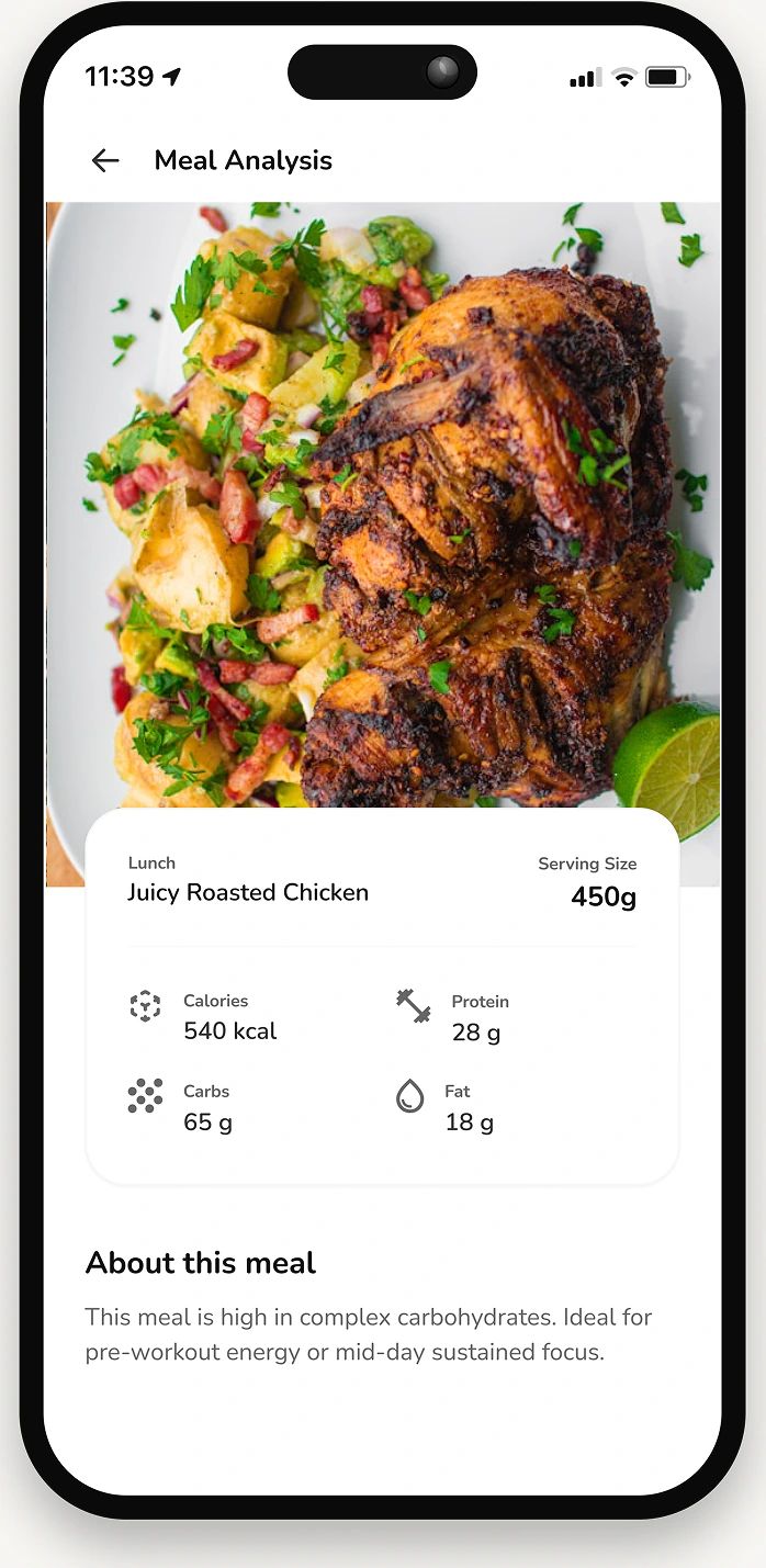
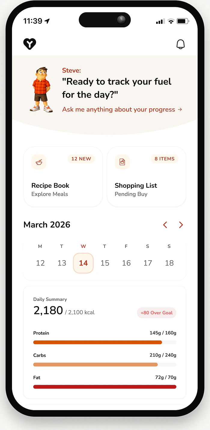
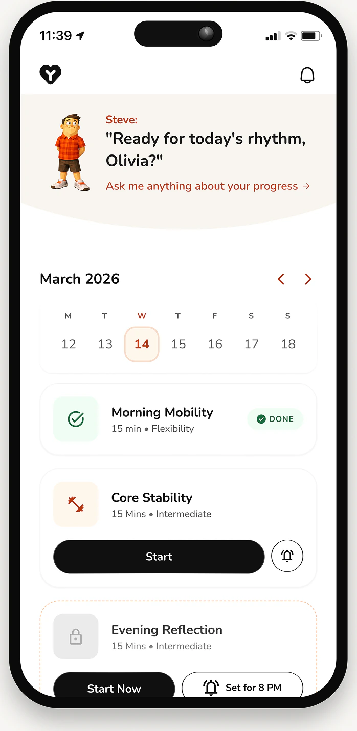
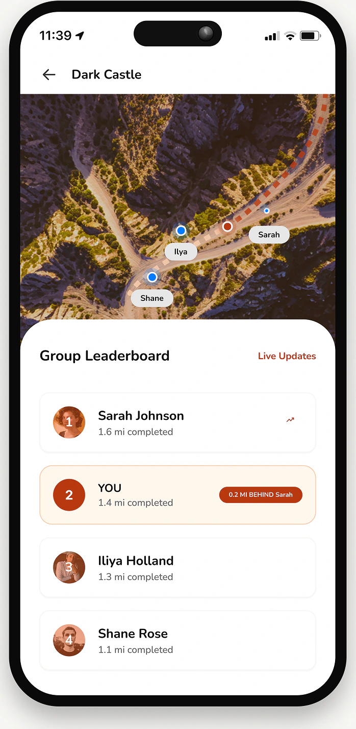
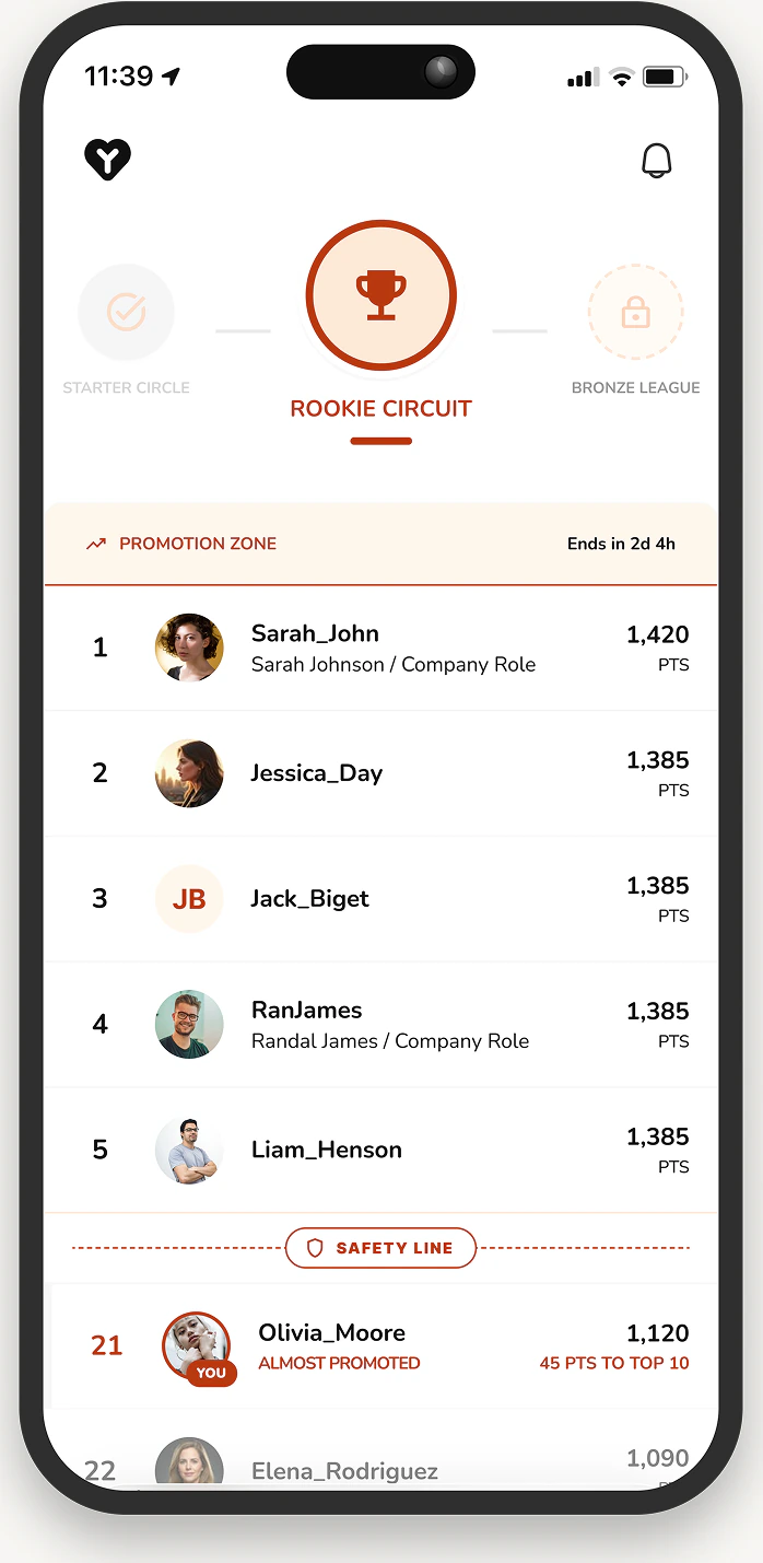
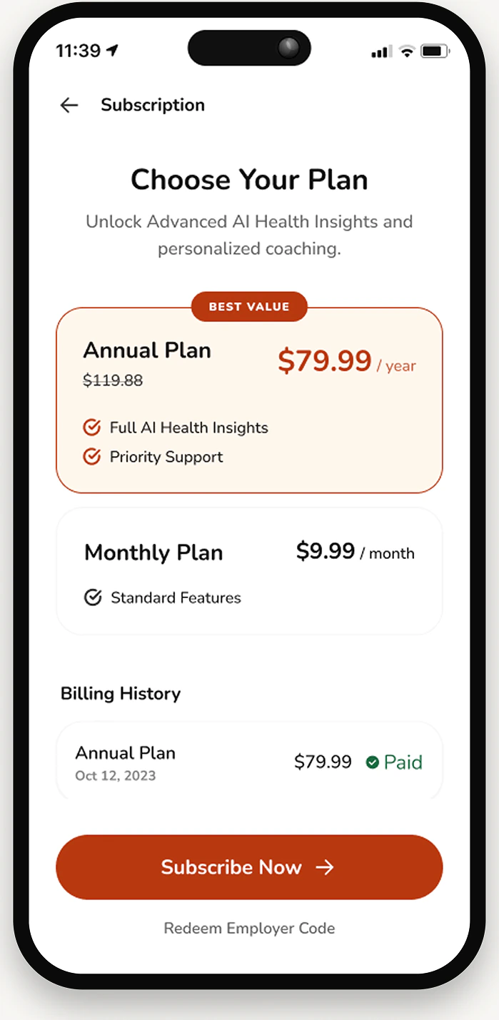
Building on the validated wireframes, I developed the high-fidelity designs that turn YouDoo’s functionality into something people would want to open. This phase was about visual hierarchy, accessibility, and the interaction detail that makes an app feel intuitive rather than merely complete.
- A clean, modern interface that simplifies health tracking
- Personalised dashboards that unify mood, movement, and nutrition
- Progress indicators, streaks, and leaderboards to drive engagement
- Clear visual feedback for dietary restrictions, alerts, and recommendations
Handoff
To make the transition from design to development smooth, I prepared detailed handoff documentation and assets. Every screen, component, and interaction was organised and shared with clear specifications, spacing, typography, colour tokens, and behaviour states.
The fully tokenised system did most of the work here. With primitive and semantic variables already in place, developers could implement consistently without translating a hex value by hand. Interactive prototypes and annotations covered user flows, edge cases, and micro-interactions, which is where ambiguity usually costs time.
Regular syncs with the developers kept feedback loops short and the implementation close to the intended experience.
Beta testing
YouDoo is in TestFlight, and I'm one of the people testing it. So this case study doesn't get to end with a launch metric. What it has instead is a build in real hands and a set of questions we're actively trying to answer.
Four measures are what the design is being judged against:
- Engagement - whether people open it on days nothing prompts them to. A health companion that only works with a notification behind it hasn't earned the habit.
- Retention - the figures this case study opened with are the bar: 53% of health apps uninstalled within 30 days, ~3% still active. Beta is where we find out whether the integrated model bends that curve or just changes the interface.
- Feature usage - mood, movement, and nutrition were designed as one loop. If testers use one and ignore the other two, the central premise is wrong, and it's far better to learn that now than after a launch.
- Task completion - logging a meal, joining a challenge, finding a recipe that clears a dietary restriction. These are the flows the whole product rests on.
We're gathering that from TestFlight feedback and direct conversations with testers, analytics on drop-off points and feature adoption, and behavioural patterns across the length of the beta.
Takeaways
Integration was the product, not a feature
The competitive analysis did not turn up a missing feature. MyFitnessPal tracks food well and Strava does social well; what nobody had done was join mood, movement, nutrition, dietary restrictions, and social challenges into one loop. Designing the connections between those things mattered more than designing any one of them.
Tokens before screens
Splitting the system into primitive and semantic variables before the high-fidelity work meant theming stayed flexible, updates stayed cheap, and handoff needed almost no translation. It is the least visible decision in the project and the one that saved the most time.
Social pressure is a design setting
The research was consistent: people want accountability, not competition. “Social fitness apps feel competitive or intimidating” shaped how challenges and leaderboards were framed, supportive by default, with the competitive edge dialled down rather than up.
A habit product is judged after launch, not at handoff
Everything up to the high-fidelity screens is a hypothesis. The retention numbers this case study opens with are exactly the ones YouDoo has to beat, which is why the post-launch monitoring is part of the work rather than an epilogue to it.