Context
Overview
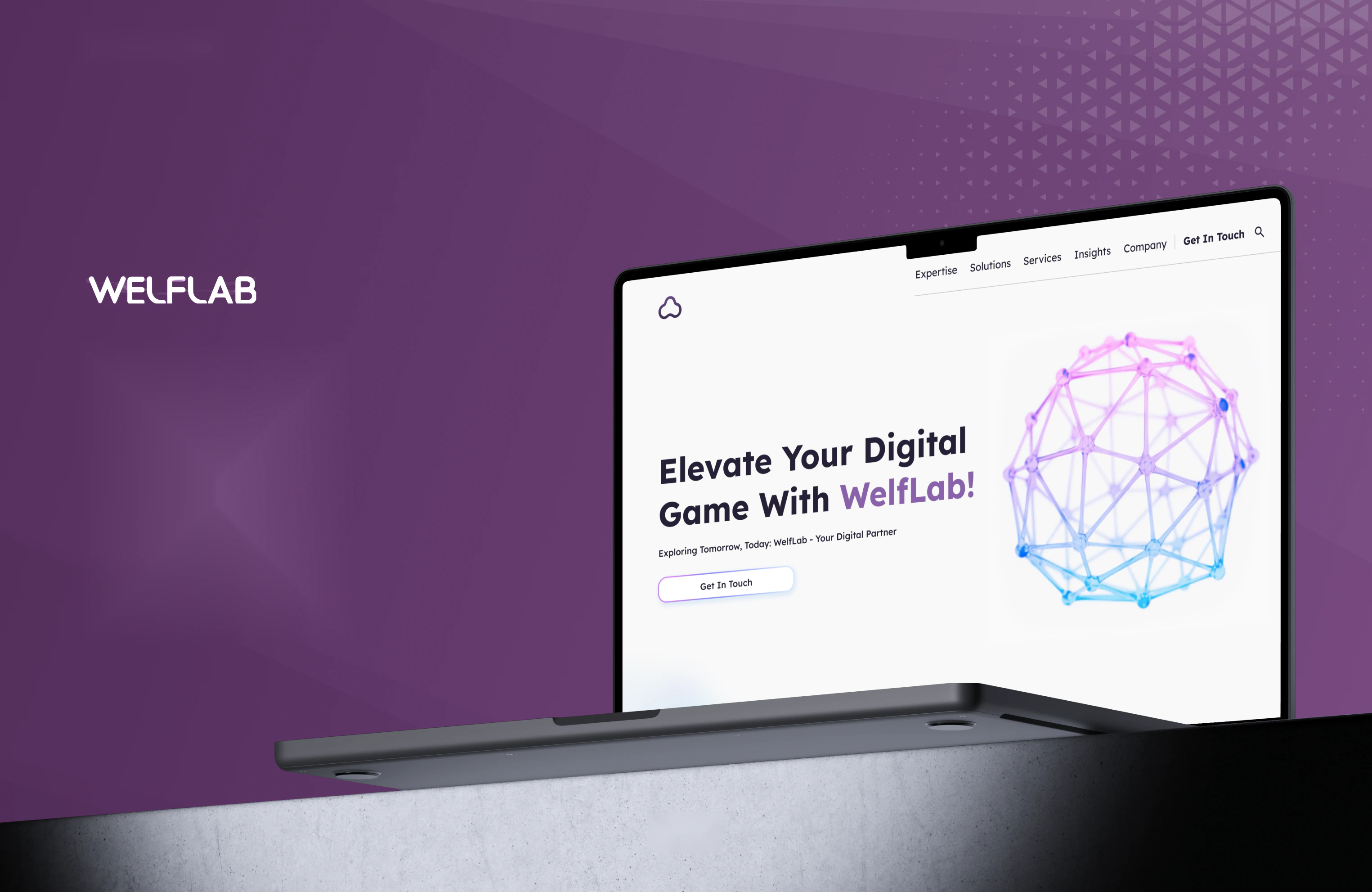
Welf Lab builds digital products for global brands and startups. The site was the front door to that, and it was not doing the job, the offering is genuinely broad, and breadth is hard to navigate. This project covered market and competitor research, a card-sorting exercise to rebuild the navigation, a full rebrand, and the high-fidelity design that came out of both.
My Role
I ran the market research and competitive analysis, built the persona, facilitated the card sort with six participants, designed the wireframes, led the rebrand from mood board through to the final logo, produced the high-fidelity UI, and ran the usability testing.
Project Brief
Welf Lab’s goal is to simplify the process of creating and launching digital products. Many businesses struggle to align design, development, and project management, which leads to inefficiency and missed opportunities for growth.
The Challenge: A broad offering nobody could navigate
Welf Lab does industries, expertise, and services - three overlapping ways of describing the same capability. A visitor arriving with a specific need had no obvious path to the page that answered it.
The solution
I designed a platform that optimises collaboration between businesses and product teams. Taking a user-centred approach meant starting from how clients actually describe what they need, by industry, by capability, or by service, and building the navigation around those mental models rather than around Welf Lab’s internal org chart.
Research
To design something that actually helps a business choose a partner, I ran market research and competitive analysis to understand what companies looking for digital product work are trying to do.
Research goals
- Gain insight into digital product trends
- Identify the target market and competitors
- Understand how businesses discover and engage with digital solutions
- Evaluate common pain points in digital product development
Market trends
- Rising demand for digital solutions - the market keeps growing as businesses prioritise technology-driven strategies for efficiency and scale
- Cloud-based dominance - over 70% of organisations rely on cloud infrastructure, favouring flexible, remote-friendly platforms
- Mobile optimisation - responsive, mobile-friendly platforms are increasingly favoured
- Increased focus on data security - rising cyber threats push businesses toward secure platforms
- Growth in customisation needs - companies want tailored solutions for specific business goals
Consumer trends
- Preference for efficiency - over 50% of businesses prioritise platforms that streamline workflows and reduce complexity
- Demand for innovation - nearly 40% of companies, especially startups, value cutting-edge tools and features
- Willingness to invest - businesses will pay a premium for high-quality, reliable, customisable solutions
- Feature appeal - seasonal updates and unique offerings significantly influence adoption and loyalty
- Frequency of use - around 25% use digital product platforms weekly, 35% daily for ongoing projects
- Offline to online shift - many businesses still rely on traditional methods, leaving room for better digital adoption
Two things in there shaped the design more than the rest. Businesses want efficiency above novelty, and they are willing to pay for it - which means the site’s job is to make capability legible fast, not to impress.
Competitive analysis
A deep dive into the strengths and weaknesses of the leading players in digital design, IDEO, Frog Design, and Accenture. The point was to find where Welf Lab could carve out a niche, and the gap turned out to be consistent across all three: affordability, accessibility, and rapid prototyping for small to mid-sized businesses.
IDEO
Strengths
- Renowned human-centred design methodology, with a strong reputation for innovation and creative problem-solving
- Diverse solutions across industries - design, strategy, and cultural change
- Strong emphasis on user research and empathy to deliver tailored, impactful design
Weaknesses
- Premium pricing makes it less accessible to startups and smaller businesses
- Focused more on the ideation phase, with less emphasis on rapid prototyping or iterative development
Accenture
Strengths
- Blends service design and digital transformation to deliver holistic experiences
- Leverages Accenture’s resources, with access to vast tech expertise and tools
- Strong in cross-channel experiences, ideal for omnichannel strategies
Weaknesses
- Primarily serves large corporations, often neglecting smaller or niche businesses
- Part of a massive corporation, which can mean slower decision-making and less flexibility
Frog Design
Strengths
- Combines industrial design expertise with cutting-edge digital innovation
- Strong end-to-end portfolio, from branding through to implementation
- Global presence, with experience delivering for large-scale enterprises
Weaknesses
- Heavy focus on enterprise-level clients, which limits accessibility for smaller businesses
- Processes can be lengthy, which may not suit clients seeking rapid development and launch
All three are excellent and all three are built for large clients. That is the opening: a studio that can do serious work at a scale and speed a small business can actually commission.
Persona
I built the persona from industry reports, competitor reviews, and customer feedback. It kept surfacing the same person: a small business owner or startup founder who needs cost-effective, high-quality digital product work and has been burned by generic software.
“I want a partner that understands my vision and can translate it into tools that make my business thrive. I’m tired of wasting time on off-the-shelf solutions that don’t fit my needs.”
Sarah runs a thriving e-commerce store specialising in sustainable, locally sourced home goods. She excels at product curation and customer engagement, but struggles to scale the business and optimise her tech infrastructure. She is exploring custom AI, web, and mobile solutions to improve operations and better serve a growing customer base.
Motivations
- Build an efficient tech ecosystem so she can focus on expanding the business
- Offer customers a seamless, enjoyable shopping experience powered by innovative tech
- Ensure her technology investments yield a real return
Goals
- Streamline operations with custom software tailored to her needs
- Leverage AI and mobile apps to improve customer experience and boost revenue
- Work with a trustworthy, efficient team to implement scalable tech without wasting resources
What that means for the site
- Capability has to be legible without a sales call
- Pricing and process expectations need to be addressed, not avoided
- Proof of similar work matters more than a statement of philosophy
Frustrations
- Overwhelmed by the complexity of finding reliable developers who understand her business goals
- Limited by generic, one-size-fits-all software that fails to meet her specific requirements
- Concerned about hidden costs and unreliable timelines when outsourcing development
Card sorting
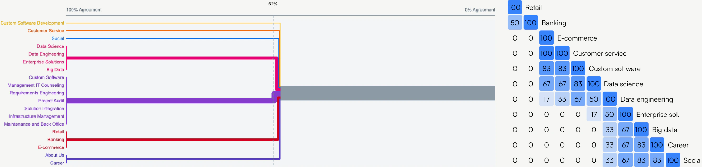
To build a navigation structure people could actually use, I ran a hybrid card sort with six participants drawn from the target audience, small business owners, project managers, and IT decision-makers. They categorised labelled cards like “Retail”, “Banking”, “Data Science”, and “Project Audit”.
The results revealed clear mental models, and those became the structure. What matters here is that the four groups are not how Welf Lab describes itself internally, they are how clients describe what they came looking for.
Solutions
Organised by industry, Retail, Banking, Social, and E-commerce. Each opens onto relevant projects, which are themselves clickable through to detail pages.
Expertise
Grouped by core capability, Data Science, Data Engineering, Custom Software, Enterprise Solutions, and Big Data, each showing use cases.
Services
The full offering, Management IT Counseling, Requirements Engineering, Project Audit, Custom Software Development, Solution Integration, Infrastructure Management, Maintenance and Back Office, and Data Engineering.
Company
Simplified down to About Us and Career.
Get in Touch
Pulled out as a separate, prominent call to action rather than buried under Company - the one thing every visitor eventually needs, given its own affordance.
The outcome is a clean, efficient navigation that lets someone find industry-specific solutions, expertise, or services by whichever route matches how they think - with a clear path to conversion from any of them.
Wireframes
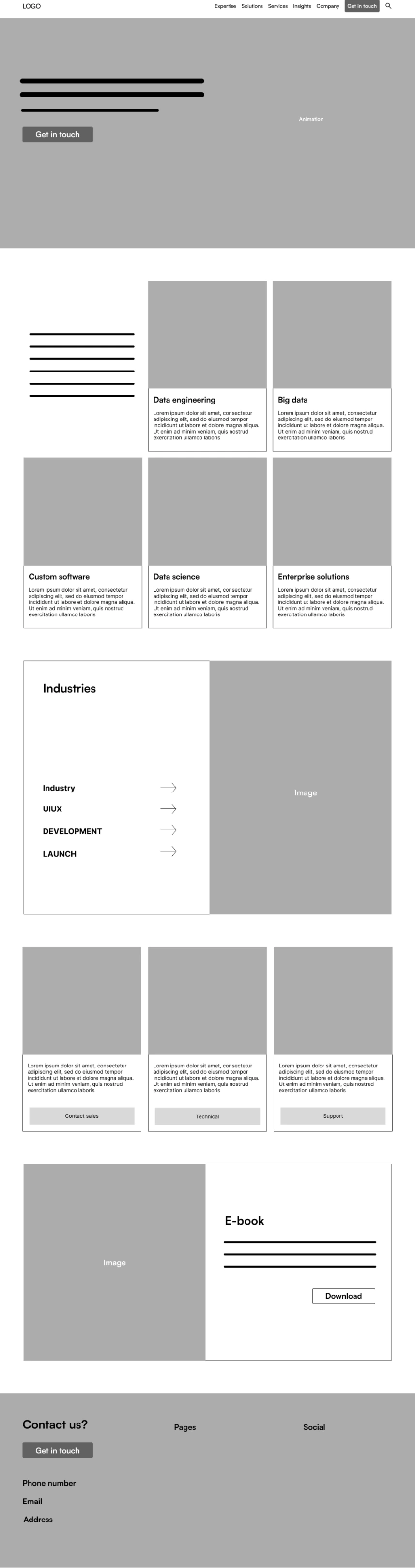
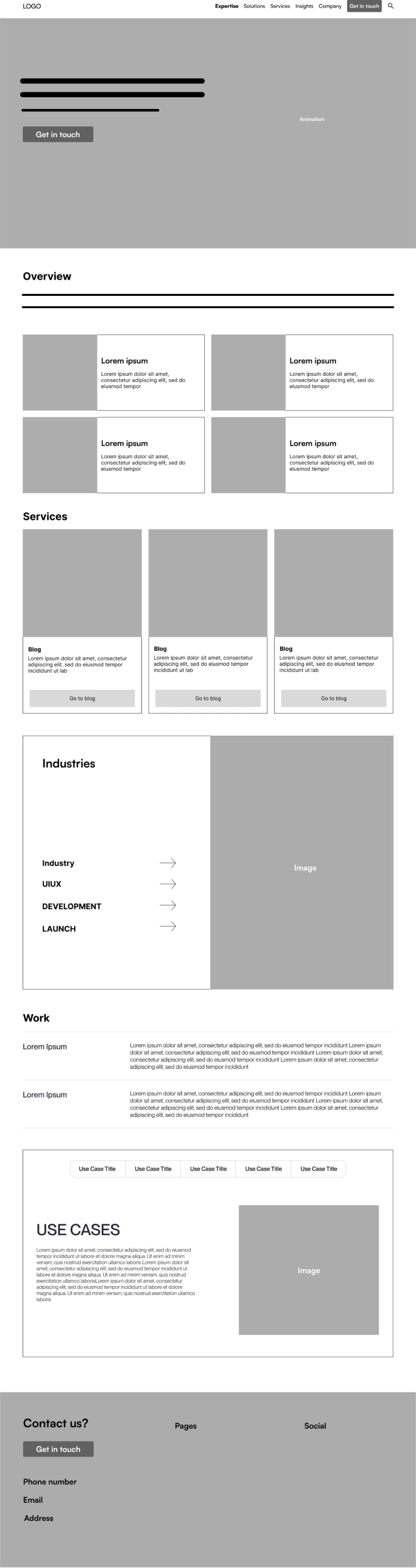
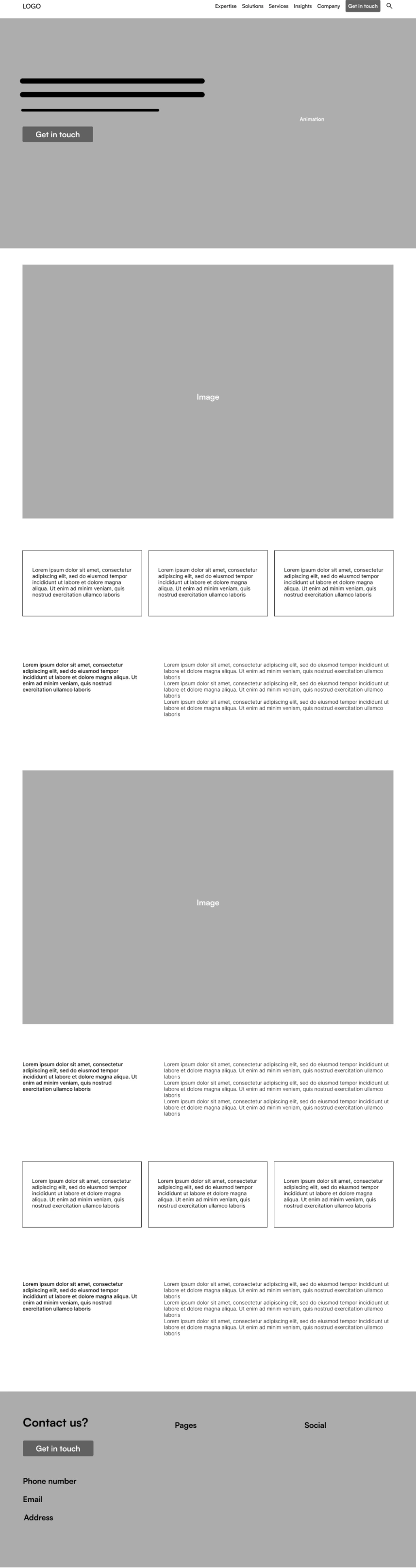
With the structure settled, the wireframes defined layout and hierarchy, navigation, content placement, and the pathways through the site. Working at this fidelity kept the argument on whether someone could find what they needed, not on how it looked.
These became the foundation for the visual design, aligning the structure with both user needs and business objectives before a single brand decision was made.
Rebranding
Before the UI phase, the focus shifted to rebranding Welf Lab so the identity matched where the company was going. I started from its core attributes, modern, neutral, fresh, simple, minimal, and built a mood board to establish a visual direction.
From there I explored multiple logo concepts, and through several rounds of iteration refined the strongest into a final mark that carries the vision and values, setting the foundation for everything the site does visually.

High-fidelity UI
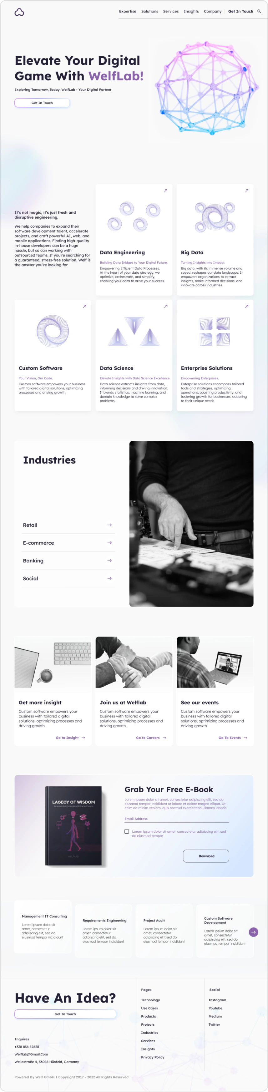
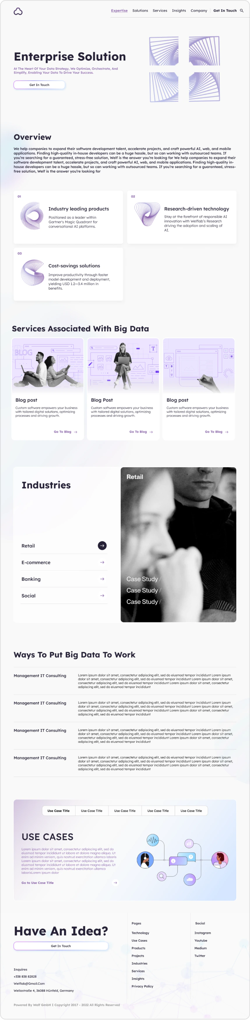
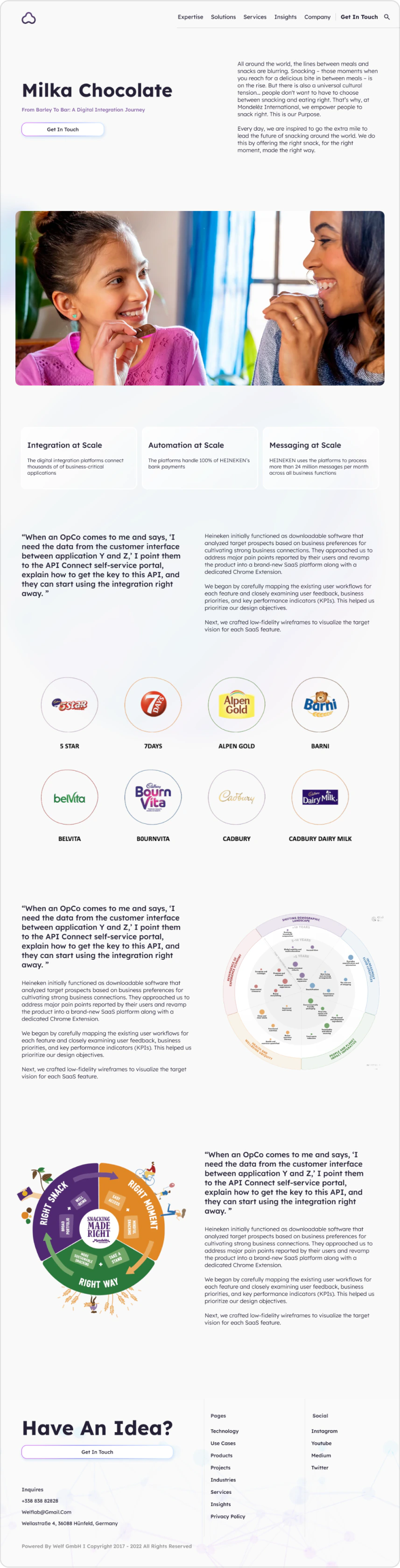
With the new branding established, I developed the visual design for the site’s key pages on top of the wireframes. The work was in integrating the identity consistently, layout, typography, colour, and imagery holding together across pages that do quite different jobs.
These designs became the basis for the interactive prototype used in testing.
Usability testing
6 participantsInteractive prototype
I tested the prototype to evaluate whether the new structure actually worked. Clear patterns emerged, and they split neatly into what held and what did not.
navigated to the core service pages, Enterprise AI, Big Data, Data Science, without errors
struggled to find specific information about the IT management consulting services
overlooked the navigation menu in the header and scrolled the homepage looking for links instead
had difficulty distinguishing between closely related offerings like “Data Science” and “Big Data”
were unsure about the flow for contacting Welf Lab or requesting a consultation
Insights gained
- Users prefer quick access to service-specific detail without needing to scroll extensively
- The services are detailed and comprehensive, but people need clearer differentiation between similar offerings, and more approachable language for technical terms
- Visitors want faster access to service-specific detail without exploring multiple sections or links
Next steps
Given the timeline and the test results, the iterations are being implemented in stages rather than all at once. The first wave targets navigation and the contact flow, because those two showed the highest impact on satisfaction during testing. Refinements to content clarity and layout follow in subsequent updates.
First
Navigation and contact flow
The header menu being overlooked by half the participants, and the uncertainty about how to request a consultation, are both conversion problems. They go first.
Next
Content clarity and language
Differentiating similar service offerings and making technical terms more approachable, the fix that most of the test failures actually point at.
Then
Layout refinement
Reducing how far someone has to scroll to reach service-specific detail.
Takeaways
Structure and vocabulary are different problems
The card sort fixed the structure, 6 of 6 found the core service pages without error. What it could not fix was that “Data Science” and “Big Data” mean roughly the same thing to a visitor. Sorting cards tells you how people group things; it does not tell you whether your labels are the right words.
Navigation only works if people look at it
Three of six ignored the header entirely and scrolled instead. That is a useful reminder that a considered IA is invisible to anyone who never engages with the menu, the homepage has to carry the same paths in-page, not just in the nav.
Rebrand after structure, not before
Doing the card sort and wireframes first meant the brand work had something to be right about. The identity was applied to a structure that already worked, rather than a structure being retrofitted to a look.
Shipping in waves is a real decision
The fixes are going out in stages against a tight timeline. That is worth stating plainly rather than presenting the design as finished, it is how most work actually ships, and saying so is more credible than implying otherwise.