
Context
Overview
HUDU is a two-sided marketplace: Listers post a job with photos and a description, Doers bid on it, and the platform holds the money in escrow until the work is approved. The model was working, what was not working was the interface around it. This project was a redesign of the three surfaces where people were dropping out: the homepage, the project-listing flow, and the profile.
My Role
I ran the competitive analysis, interviewed six frequent users, built the empathy map and persona, defined the project goals, and designed and tested the high-fidelity prototypes for all three surfaces.
Project Brief
Users faced significant challenges with a cluttered interface and an overwhelming design. A lengthy project-posting process left people stuck partway through. A disorganised profile layout made key features hard to find. And there was nothing to reward participation, so people did not come back.
The Challenge: Cluttered design and ineffective navigation were costing HUDU its users
The marketplace mechanics were sound. The interface around them was losing people at exactly the moments that mattered - posting a job, completing a profile, and choosing a bid.
- 45%
- abandoned the project-posting process
- 60%
- struggled to find key features
- 40%
- left profiles incomplete
- 30%
- drop in daily active users in six months
Those four numbers are the whole brief. Everything that follows is an attempt to move them.
Competitive analysis
I analysed key competitors in the odd job marketplace to find design and feature gaps HUDU could take advantage of. Apps like TaskRabbit and Thumbtack excel at offering a wide range of services and strong task filters. None of them provide a seamless location-based job search or an intuitive profile setup, both critical for someone who just wants the thing done.
Those gaps set the direction: simplify job posting, introduce location-based filtering, and rebuild profiles so a job is easier to judge and easier to win.
Care
Strengths
- Simple navigation and user-friendly layout
- Detailed caregiver profiles
- Clear task matching process
- Flexible working hours and location choices
Weaknesses
- High fees for posting jobs
- Lacks job categories outside caregiving
- Payment processing and service fees on both sides
Thumbtack
Strengths
- Intuitive, clean interface
- Simplified project search process
- Matches users with local service providers
- In-app messaging and easy quote requests
Weaknesses
- Job categories and pricing can be unclear
- Limited task options outside cleaning and repairs
- Limited transparency in the quoting process
TaskRabbit
Strengths
- Simple, minimalist interface
- Strong category filters for job types
- Clear task details
- Doers set their own rates and schedule
- Strong support and community reviews
Weaknesses
- Excessive number of steps for some tasks
- Task visibility can be overwhelming
- Limited filtering for specific job types and locations
Handy
Strengths
- User-friendly design and service filtering
- Focus on home improvement and cleaning
- Professional services with background checks
- Easy booking and payment process
Weaknesses
- Task management could be more flexible
- Narrow job scope
User interviews
I had a solid picture of the market and the competitors, but not of the people actually using HUDU. So I interviewed six frequent users who matched the demographics from the market research, asking open-ended questions about their needs, pain points, and expectations.
Research goals
- Identify what motivates users to choose HUDU for posting jobs or browsing services
- Discover the pain points in posting, browsing listings, and managing profiles
- Understand what a seamless, efficient experience on HUDU would actually feel like
- Evaluate competitors from the users’ perspective, and how HUDU could differentiate
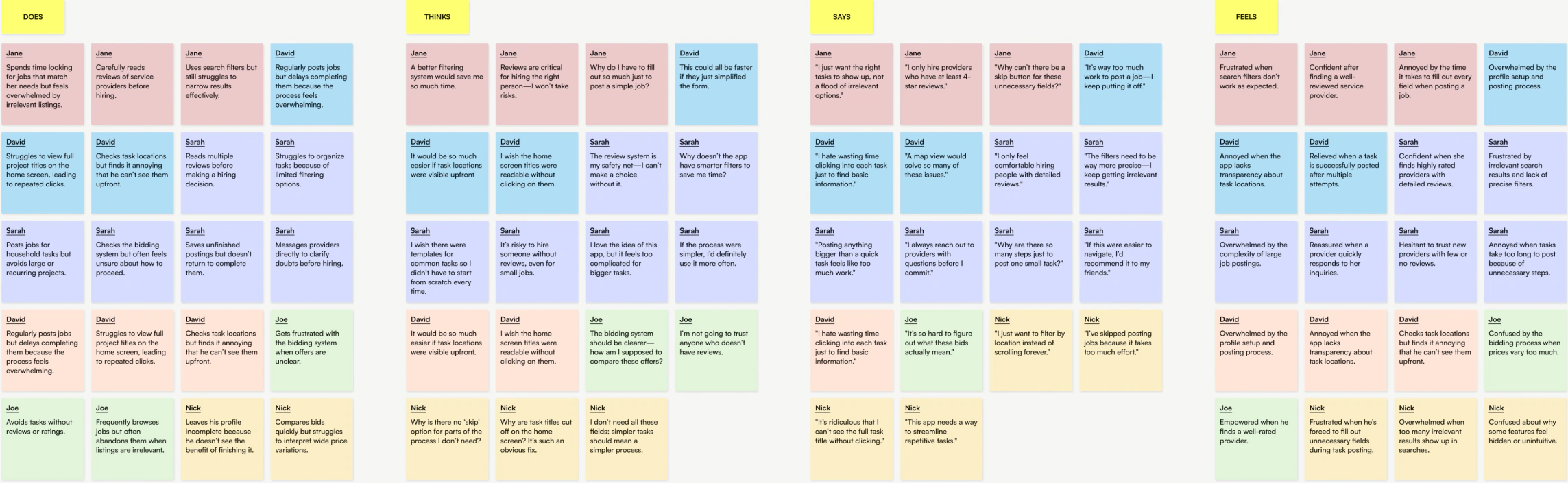
I mapped the notes onto an empathy map, and patterns started to emerge across the categories. Four came through strongly enough to design against.
Better filtering and task visibility
What we heard
- Ineffective filters and unclear task details frustrate users
- Task locations, filters, and titles need to be more visible
What it needs
- Implement smarter filters for locations and task-specific needs
- Ensure task titles and details are accessible from the home screen
A simpler, more streamlined posting process
What we heard
- The posting process feels overwhelming and time-consuming, with unnecessary fields and redundant steps
- Users want a faster, more intuitive way to post with fewer obstacles
What it needs
- Reduce the number of form fields and steps required to post a task
- Introduce templates or shortcuts for recurring tasks
Cluttered, difficult-to-use profiles
What we heard
- Cluttered profiles are hard to navigate and discourage completion
- Users leave profiles incomplete because the process feels tedious and the value is unclear
What it needs
- Redesign profiles to be cleaner and easier to navigate
- Add progress indicators and clear benefits to encourage completion
Difficulty trusting and choosing bids
What we heard
- Users struggle to evaluate bids and do not know what factors to weigh
- Lack of reviews or ratings makes providers hard to trust
What it needs
- Create a transparent bid evaluation system with clear metrics
- Offer trust signals like verified profiles and recommendations
Persona
The interviews and empathy map produced one persona who sits on both sides of the marketplace - which is the thing that makes HUDU harder to design than a one-sided service app. Denise posts jobs and takes them.
“I need a platform that saves me time, not one that adds to my workload. Trust and simplicity are everything to me.”
Denise is both a poster and a provider. As a poster she needs help with home repairs and cleaning; as a provider she uses the platform to find short-term freelance marketing gigs. Time is her most valuable asset, and she dislikes wasting it on inefficient processes.
Motivations
- Find reliable, affordable providers for household tasks
- Build her freelance career by easily connecting with clients
- Save time with streamlined processes
Behaviours
- Posts larger tasks infrequently but is meticulous about reviews and ratings
- Checks the platform multiple times a day for new freelance opportunities
- Often abandons tasks when processes feel overwhelming or unclear
Needs
- Better filtering and task visibility
- Simplified processes
- Streamlined profiles
- Enhanced trust features
Frustrations & pain points
- Irrelevant search results and ineffective filters
- Lack of clarity in task details upfront
- The posting process is unnecessarily long and complicated
- Too many steps and fields that feel redundant
- Cluttered, incomplete profiles are overwhelming
- Unclear why completing her own profile is worth the effort
- Hard to decide between providers without clear reviews or ratings
Project goals
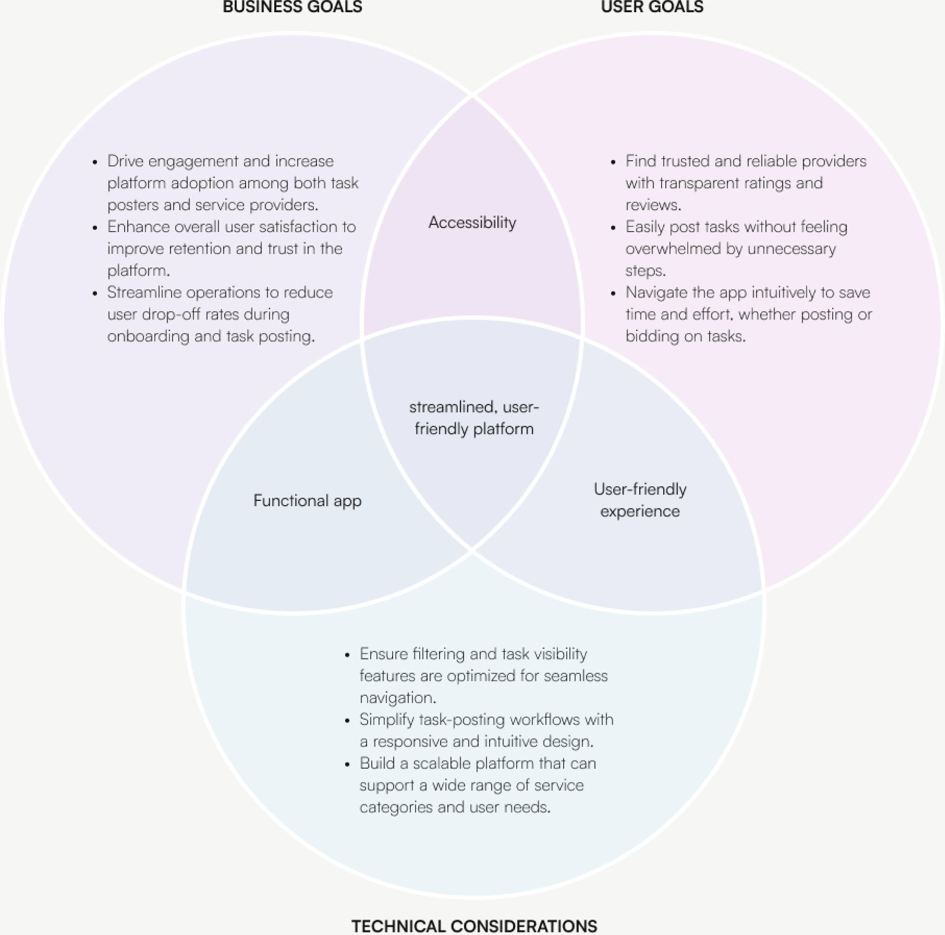
To guide the problem-solving, I mapped the intersection between business goals, user goals, and technical constraints. Laying out what each side wanted separately, and where those wants overlap, made it much easier to argue for what to build first, because the overlap is where a solution pays for itself three times over.
High-fidelity design and testing
Deadlines were tight, so I made a call: skip a further round of wireframe testing and go straight to high-fidelity prototypes for the homepage, the listing process, and the profile. The bet was that the friction points were already well enough understood from research that the remaining risk was in the detail, copy, patterns, and consistency, which low fidelity would not have surfaced anyway.
Testing the prototype went well, with most tasks completed at a rate of 75% or higher. Some issues persisted - navigating the redesigned listing process and exploring the new map view both needed clearer guidance and better emphasis on what had changed.
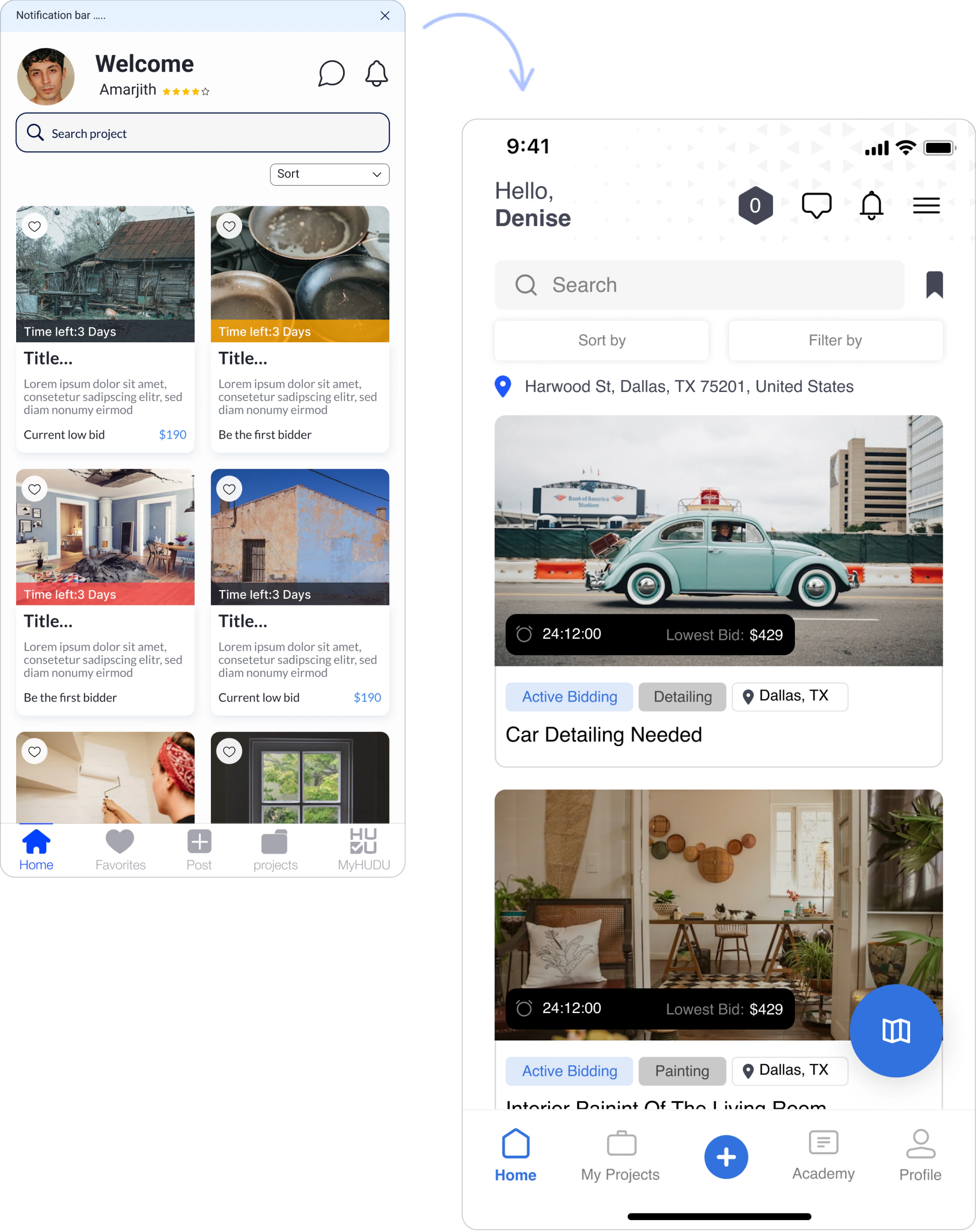
Homepage
Outcome of the home redesign
- Enlarged images significantly enhanced visual engagement and made the homepage more appealing
- Displayed location data helped users quickly find projects relevant to their geographic preferences
- The map feature was intuitive and highly appreciated, letting users explore projects by location
- Filter and sort options reduced the time taken to locate a desired project
Listing flow
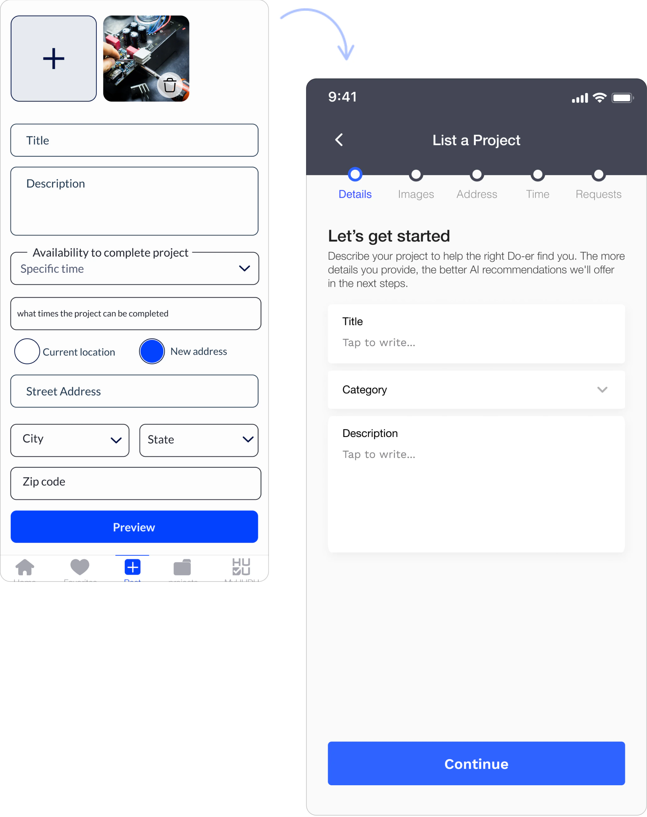
Outcome of the listing redesign
- Breaking the process into five distinct steps reduced overwhelm and improved clarity
- Contextual guidance at each step made the process more intuitive and less intimidating
- Redesigned input fields improved usability and streamlined the flow
- A dedicated questions section empowered Listers to make informed decisions and get better Doer matches
Profile
Outcome of the profile redesign
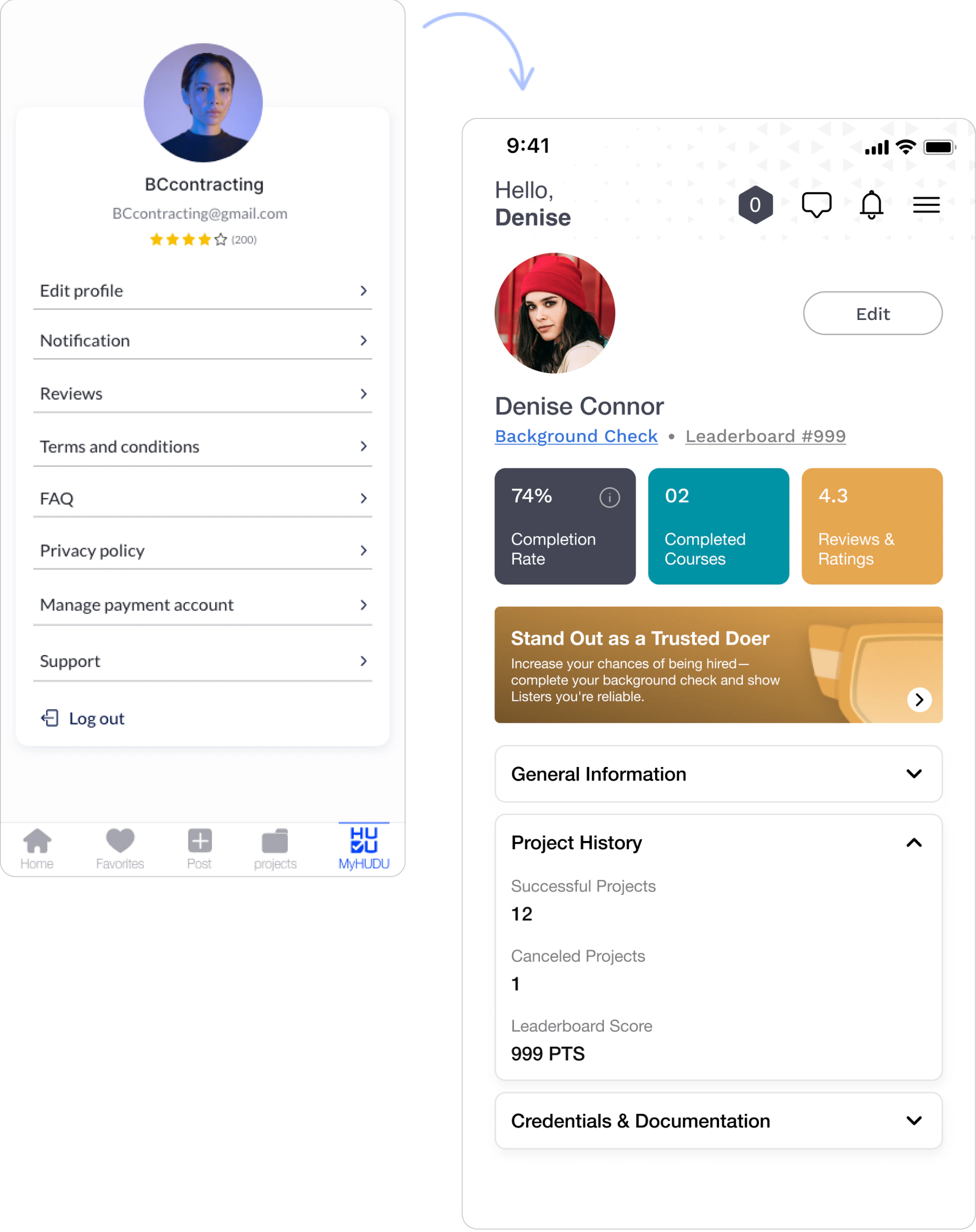
- The new layout, with clearly defined sections, made the profile easier to navigate and better looking
- Relevant information was highlighted, reducing clicking and improving access to key details
- A prominent banner encouraged background check upgrades, producing a 12% increase in upgrades
- Breaking information into sections reduced friction and helped users find what they needed quickly
Result
App store feedback after the redesign was the clearest signal. Reviews consistently picked out improved navigation, better profiles, and the revamped interface, and the average rating rose to 4.7 stars.
- 4.7★
- average App Store rating after the redesign
- 10,000+
- users on the platform
- 39%
- growth in 90 days
- 12%
- increase in background-check upgrades
What users said
★★★★★
My go-to app for a to-do list to be completed
I love that it’s so user friendly and easy to message the lister once awarded the project. I don’t have to worry about being paid - once it’s awarded, the project funds are already secure. Once I complete the project I get the deposit into our account.
zach a w06/10/2023
★★★★★
Where has this been all my life?!
As a single mother and sole business owner, this app has changed my life. Instead of asking all my friends or posting a random status on Facebook, I can post what I need. Verified people bid on the job, and if the price isn’t reasonable I can deny it.
A.Moore83106/24/2023
★★★★★
Better than Angie’s List
This app is a great way for me to make some extra money on the side. It helped me get my skills out to many different people with needs in their lives. The organisation of the app is easy to navigate and posting something is easy too.
DeltaChi77706/24/2023
★★★★★
Excellent platform
More extensible, practical and easy to use than any other remotely comparable solution I’ve used or seen in my 12 years of IT. Easy to deploy and integrate, intuitive and customisable.
Masonville1706/04/2023
10,000 users and counting
The redesign was less a project than a mission to make the gig economy legible to ordinary people. Guided by research and collaboration, the changes improved navigation, clarity, and overall satisfaction, and the platform passed 10,000 users with 39% growth in 90 days. HUDU has since expanded beyond Iowa.
Reflections
The redesign improved the experience measurably, but a marketplace keeps moving, and four things are worth watching.
Adoption of new features
The map view and the redesigned listing flow tested well, but long-term engagement is the real test. Whether people keep using the map and the sorting options is what would validate the redesign.
Profile interactions
The new profile makes information accessible and the background-check banner drove a 12% lift in upgrades. It is worth asking honestly whether that banner builds genuine trust or simply drives revenue - the answer changes how far to push it.
User behaviour trends
Tracking which features see consistent engagement, and which parts of the app stay underused, is what should guide the next round rather than instinct.
Diverse user needs
As HUDU grows beyond Iowa, users differ by region, profession, and technical confidence. Designing for that range without diluting the product is the next real constraint.
Takeaways
The mechanics were fine - the doorway was not
Escrow, bidding, and background checks all worked. What was failing was the interface in front of them, and 45% of people never got as far as posting a job. When the model is sound, the design work is about removing everything standing between someone and the thing they came to do.
Five steps felt shorter than one long form
The listing flow did not lose fields so much as gain structure. Breaking it into five distinct steps with guidance at each one reduced overwhelm, even though the process is no shorter. Perceived length is a design variable, not a fixed cost.
Profiles need a reason, not just a redesign
People were not leaving profiles incomplete because the form was ugly. They were leaving because nobody had told them what completing it bought them. Progress indicators and visible benefits did more than the layout change did.
Skipping a stage is a trade, not a saving
Going straight to high fidelity was the right call against the deadline, and the two problems that survived to testing were both structural - the kind wireframes catch cheaply. I would make the same call again and budget for the rework rather than pretend it was free.