Landing page redesign
Research & insights
The landing page was doing two jobs badly: explaining what Apsy is, and getting people to sign up. Session recordings showed visitors scrolling past the value proposition entirely and bouncing before they hit any CTA. In the survey, the most common answer to "what stopped you signing up?" was some version of "I couldn't tell what it actually does."
Key changes implemented
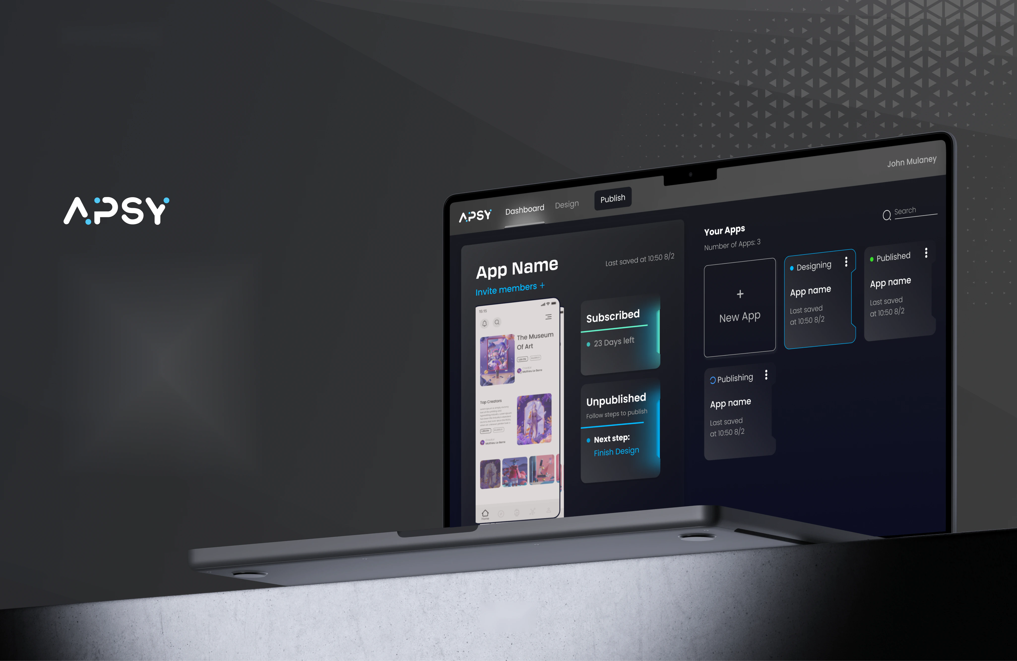
Rewrote the hero to lead with the outcome rather than the technology. Cut the page from nine scroll-sections to five. Pulled the primary CTA above the fold and repeated it once at the end. Replaced the abstract illustration with a short product visual. Removed a secondary CTA that was competing with sign-up.
Outcome
25% increase in sign-ups · 15% reduction in bounce rate · 20% more clicks on the primary CTA